Feature flags rework (#1474)
This diff tweaks our `debugFlags` framework to support setting different
default value for different environments, makes it easier to define
feature flags, and makes feature flags show up in the debug menu by
default. With this change, feature flags will default to being enabled
in dev and preview environments, but disabled in production.
Specify a feature flag like this:
```ts
const featureFlags = {
myCoolNewFeature: createFeatureFlag('myCoolNewFeature')
}
```
optionally, pass a second value to control its defaults:
```ts
const featureFlags = {
featureEnabledInProduction: createFeatureFlag('someFeature', { all: true }),
customEnabled: createFeatureFlag('otherFeature', {development: true, staging: false, production: false}),
}
```
In code, the value can be read using `featureFlags.myFeature.value`.
Remember to wrap reading it in a reactive context!
### Change Type
- [x] `patch` — Bug Fix
### Test Plan
-
### Release Notes
[internal only change]
2023-05-30 13:06:15 +00:00
|
|
|
import {
|
2023-06-03 20:46:53 +00:00
|
|
|
createShapeId,
|
Feature flags rework (#1474)
This diff tweaks our `debugFlags` framework to support setting different
default value for different environments, makes it easier to define
feature flags, and makes feature flags show up in the debug menu by
default. With this change, feature flags will default to being enabled
in dev and preview environments, but disabled in production.
Specify a feature flag like this:
```ts
const featureFlags = {
myCoolNewFeature: createFeatureFlag('myCoolNewFeature')
}
```
optionally, pass a second value to control its defaults:
```ts
const featureFlags = {
featureEnabledInProduction: createFeatureFlag('someFeature', { all: true }),
customEnabled: createFeatureFlag('otherFeature', {development: true, staging: false, production: false}),
}
```
In code, the value can be read using `featureFlags.myFeature.value`.
Remember to wrap reading it in a reactive context!
### Change Type
- [x] `patch` — Bug Fix
### Test Plan
-
### Release Notes
[internal only change]
2023-05-30 13:06:15 +00:00
|
|
|
DebugFlag,
|
|
|
|
|
debugFlags,
|
2023-06-02 15:21:45 +00:00
|
|
|
Editor,
|
Feature flags rework (#1474)
This diff tweaks our `debugFlags` framework to support setting different
default value for different environments, makes it easier to define
feature flags, and makes feature flags show up in the debug menu by
default. With this change, feature flags will default to being enabled
in dev and preview environments, but disabled in production.
Specify a feature flag like this:
```ts
const featureFlags = {
myCoolNewFeature: createFeatureFlag('myCoolNewFeature')
}
```
optionally, pass a second value to control its defaults:
```ts
const featureFlags = {
featureEnabledInProduction: createFeatureFlag('someFeature', { all: true }),
customEnabled: createFeatureFlag('otherFeature', {development: true, staging: false, production: false}),
}
```
In code, the value can be read using `featureFlags.myFeature.value`.
Remember to wrap reading it in a reactive context!
### Change Type
- [x] `patch` — Bug Fix
### Test Plan
-
### Release Notes
[internal only change]
2023-05-30 13:06:15 +00:00
|
|
|
featureFlags,
|
2023-06-02 15:21:45 +00:00
|
|
|
hardResetEditor,
|
Feature flags rework (#1474)
This diff tweaks our `debugFlags` framework to support setting different
default value for different environments, makes it easier to define
feature flags, and makes feature flags show up in the debug menu by
default. With this change, feature flags will default to being enabled
in dev and preview environments, but disabled in production.
Specify a feature flag like this:
```ts
const featureFlags = {
myCoolNewFeature: createFeatureFlag('myCoolNewFeature')
}
```
optionally, pass a second value to control its defaults:
```ts
const featureFlags = {
featureEnabledInProduction: createFeatureFlag('someFeature', { all: true }),
customEnabled: createFeatureFlag('otherFeature', {development: true, staging: false, production: false}),
}
```
In code, the value can be read using `featureFlags.myFeature.value`.
Remember to wrap reading it in a reactive context!
### Change Type
- [x] `patch` — Bug Fix
### Test Plan
-
### Release Notes
[internal only change]
2023-05-30 13:06:15 +00:00
|
|
|
TLShapePartial,
|

tldraw zero - package shuffle (#1710)
This PR moves code between our packages so that:
- @tldraw/editor is a “core” library with the engine and canvas but no
shapes, tools, or other things
- @tldraw/tldraw contains everything particular to the experience we’ve
built for tldraw
At first look, this might seem like a step away from customization and
configuration, however I believe it greatly increases the configuration
potential of the @tldraw/editor while also providing a more accurate
reflection of what configuration options actually exist for
@tldraw/tldraw.
## Library changes
@tldraw/editor re-exports its dependencies and @tldraw/tldraw re-exports
@tldraw/editor.
- users of @tldraw/editor WITHOUT @tldraw/tldraw should almost always
only import things from @tldraw/editor.
- users of @tldraw/tldraw should almost always only import things from
@tldraw/tldraw.
- @tldraw/polyfills is merged into @tldraw/editor
- @tldraw/indices is merged into @tldraw/editor
- @tldraw/primitives is merged mostly into @tldraw/editor, partially
into @tldraw/tldraw
- @tldraw/file-format is merged into @tldraw/tldraw
- @tldraw/ui is merged into @tldraw/tldraw
Many (many) utils and other code is moved from the editor to tldraw. For
example, embeds now are entirely an feature of @tldraw/tldraw. The only
big chunk of code left in core is related to arrow handling.
## API Changes
The editor can now be used without tldraw's assets. We load them in
@tldraw/tldraw instead, so feel free to use whatever fonts or images or
whatever that you like with the editor.
All tools and shapes (except for the `Group` shape) are moved to
@tldraw/tldraw. This includes the `select` tool.
You should use the editor with at least one tool, however, so you now
also need to send in an `initialState` prop to the Editor /
<TldrawEditor> component indicating which state the editor should begin
in.
The `components` prop now also accepts `SelectionForeground`.
The complex selection component that we use for tldraw is moved to
@tldraw/tldraw. The default component is quite basic but can easily be
replaced via the `components` prop. We pass down our tldraw-flavored
SelectionFg via `components`.
Likewise with the `Scribble` component: the `DefaultScribble` no longer
uses our freehand tech and is a simple path instead. We pass down the
tldraw-flavored scribble via `components`.
The `ExternalContentManager` (`Editor.externalContentManager`) is
removed and replaced with a mapping of types to handlers.
- Register new content handlers with
`Editor.registerExternalContentHandler`.
- Register new asset creation handlers (for files and URLs) with
`Editor.registerExternalAssetHandler`
### Change Type
- [x] `major` — Breaking change
### Test Plan
- [x] Unit Tests
- [x] End to end tests
### Release Notes
- [@tldraw/editor] lots, wip
- [@tldraw/ui] gone, merged to tldraw/tldraw
- [@tldraw/polyfills] gone, merged to tldraw/editor
- [@tldraw/primitives] gone, merged to tldraw/editor / tldraw/tldraw
- [@tldraw/indices] gone, merged to tldraw/editor
- [@tldraw/file-format] gone, merged to tldraw/tldraw
---------
Co-authored-by: alex <alex@dytry.ch>
2023-07-17 21:22:34 +00:00
|
|
|
track,
|
Feature flags rework (#1474)
This diff tweaks our `debugFlags` framework to support setting different
default value for different environments, makes it easier to define
feature flags, and makes feature flags show up in the debug menu by
default. With this change, feature flags will default to being enabled
in dev and preview environments, but disabled in production.
Specify a feature flag like this:
```ts
const featureFlags = {
myCoolNewFeature: createFeatureFlag('myCoolNewFeature')
}
```
optionally, pass a second value to control its defaults:
```ts
const featureFlags = {
featureEnabledInProduction: createFeatureFlag('someFeature', { all: true }),
customEnabled: createFeatureFlag('otherFeature', {development: true, staging: false, production: false}),
}
```
In code, the value can be read using `featureFlags.myFeature.value`.
Remember to wrap reading it in a reactive context!
### Change Type
- [x] `patch` — Bug Fix
### Test Plan
-
### Release Notes
[internal only change]
2023-05-30 13:06:15 +00:00
|
|
|
uniqueId,
|
2023-06-02 15:21:45 +00:00
|
|
|
useEditor,
|
tldraw zero - package shuffle (#1710)
This PR moves code between our packages so that:
- @tldraw/editor is a “core” library with the engine and canvas but no
shapes, tools, or other things
- @tldraw/tldraw contains everything particular to the experience we’ve
built for tldraw
At first look, this might seem like a step away from customization and
configuration, however I believe it greatly increases the configuration
potential of the @tldraw/editor while also providing a more accurate
reflection of what configuration options actually exist for
@tldraw/tldraw.
## Library changes
@tldraw/editor re-exports its dependencies and @tldraw/tldraw re-exports
@tldraw/editor.
- users of @tldraw/editor WITHOUT @tldraw/tldraw should almost always
only import things from @tldraw/editor.
- users of @tldraw/tldraw should almost always only import things from
@tldraw/tldraw.
- @tldraw/polyfills is merged into @tldraw/editor
- @tldraw/indices is merged into @tldraw/editor
- @tldraw/primitives is merged mostly into @tldraw/editor, partially
into @tldraw/tldraw
- @tldraw/file-format is merged into @tldraw/tldraw
- @tldraw/ui is merged into @tldraw/tldraw
Many (many) utils and other code is moved from the editor to tldraw. For
example, embeds now are entirely an feature of @tldraw/tldraw. The only
big chunk of code left in core is related to arrow handling.
## API Changes
The editor can now be used without tldraw's assets. We load them in
@tldraw/tldraw instead, so feel free to use whatever fonts or images or
whatever that you like with the editor.
All tools and shapes (except for the `Group` shape) are moved to
@tldraw/tldraw. This includes the `select` tool.
You should use the editor with at least one tool, however, so you now
also need to send in an `initialState` prop to the Editor /
<TldrawEditor> component indicating which state the editor should begin
in.
The `components` prop now also accepts `SelectionForeground`.
The complex selection component that we use for tldraw is moved to
@tldraw/tldraw. The default component is quite basic but can easily be
replaced via the `components` prop. We pass down our tldraw-flavored
SelectionFg via `components`.
Likewise with the `Scribble` component: the `DefaultScribble` no longer
uses our freehand tech and is a simple path instead. We pass down the
tldraw-flavored scribble via `components`.
The `ExternalContentManager` (`Editor.externalContentManager`) is
removed and replaced with a mapping of types to handlers.
- Register new content handlers with
`Editor.registerExternalContentHandler`.
- Register new asset creation handlers (for files and URLs) with
`Editor.registerExternalAssetHandler`
### Change Type
- [x] `major` — Breaking change
### Test Plan
- [x] Unit Tests
- [x] End to end tests
### Release Notes
- [@tldraw/editor] lots, wip
- [@tldraw/ui] gone, merged to tldraw/tldraw
- [@tldraw/polyfills] gone, merged to tldraw/editor
- [@tldraw/primitives] gone, merged to tldraw/editor / tldraw/tldraw
- [@tldraw/indices] gone, merged to tldraw/editor
- [@tldraw/file-format] gone, merged to tldraw/tldraw
---------
Co-authored-by: alex <alex@dytry.ch>
2023-07-17 21:22:34 +00:00
|
|
|
useValue,
|
2024-01-29 10:29:28 +00:00
|
|
|
Vec,
|
Feature flags rework (#1474)
This diff tweaks our `debugFlags` framework to support setting different
default value for different environments, makes it easier to define
feature flags, and makes feature flags show up in the debug menu by
default. With this change, feature flags will default to being enabled
in dev and preview environments, but disabled in production.
Specify a feature flag like this:
```ts
const featureFlags = {
myCoolNewFeature: createFeatureFlag('myCoolNewFeature')
}
```
optionally, pass a second value to control its defaults:
```ts
const featureFlags = {
featureEnabledInProduction: createFeatureFlag('someFeature', { all: true }),
customEnabled: createFeatureFlag('otherFeature', {development: true, staging: false, production: false}),
}
```
In code, the value can be read using `featureFlags.myFeature.value`.
Remember to wrap reading it in a reactive context!
### Change Type
- [x] `patch` — Bug Fix
### Test Plan
-
### Release Notes
[internal only change]
2023-05-30 13:06:15 +00:00
|
|
|
} from '@tldraw/editor'
|
2023-04-25 11:01:25 +00:00
|
|
|
import * as React from 'react'
|
|
|
|
|
import { useDialogs } from '../hooks/useDialogsProvider'
|
|
|
|
|
import { useToasts } from '../hooks/useToastsProvider'
|
2023-10-28 21:58:32 +00:00
|
|
|
import { untranslated, useTranslation } from '../hooks/useTranslation/useTranslation'
|
2023-04-25 11:01:25 +00:00
|
|
|
import { Button } from './primitives/Button'
|
|
|
|
|
import * as Dialog from './primitives/Dialog'
|
|
|
|
|
import * as DropdownMenu from './primitives/DropdownMenu'
|
|
|
|
|
|
|
|
|
|
let t = 0
|
|
|
|
|
|
2023-06-02 15:21:45 +00:00
|
|
|
function createNShapes(editor: Editor, n: number) {
|
2023-04-25 11:01:25 +00:00
|
|
|
const shapesToCreate: TLShapePartial[] = Array(n)
|
|
|
|
|
const cols = Math.floor(Math.sqrt(n))
|
|
|
|
|
|
|
|
|
|
for (let i = 0; i < n; i++) {
|
|
|
|
|
t++
|
|
|
|
|
shapesToCreate[i] = {
|
2023-06-03 20:46:53 +00:00
|
|
|
id: createShapeId('box' + t),
|
2023-04-25 11:01:25 +00:00
|
|
|
type: 'geo',
|
|
|
|
|
x: (i % cols) * 132,
|
|
|
|
|
y: Math.floor(i / cols) * 132,
|
|
|
|
|
}
|
|
|
|
|
}
|
|
|
|
|
|
2023-06-02 15:21:45 +00:00
|
|
|
editor.batch(() => {
|
2023-08-13 15:55:24 +00:00
|
|
|
editor.createShapes(shapesToCreate).setSelectedShapes(shapesToCreate.map((s) => s.id))
|
2023-04-25 11:01:25 +00:00
|
|
|
})
|
|
|
|
|
}
|
|
|
|
|
|
2023-06-02 21:16:09 +00:00
|
|
|
/** @internal */
|
2023-04-25 11:01:25 +00:00
|
|
|
export const DebugPanel = React.memo(function DebugPanel({
|
|
|
|
|
renderDebugMenuItems,
|
|
|
|
|
}: {
|
|
|
|
|
renderDebugMenuItems: (() => React.ReactNode) | null
|
|
|
|
|
}) {
|
|
|
|
|
const msg = useTranslation()
|
2024-01-24 12:23:26 +00:00
|
|
|
const showFps = useValue('show_fps', () => debugFlags.showFps.get(), [debugFlags])
|
|
|
|
|
|
2023-04-25 11:01:25 +00:00
|
|
|
return (
|
|
|
|
|
<div className="tlui-debug-panel">
|
|
|
|
|
<CurrentState />
|
2024-01-24 12:23:26 +00:00
|
|
|
{showFps && <FPS />}
|
2023-04-25 11:01:25 +00:00
|
|
|
<ShapeCount />
|
|
|
|
|
<DropdownMenu.Root id="debug">
|
|
|
|
|
<DropdownMenu.Trigger>
|
2023-10-28 21:58:32 +00:00
|
|
|
<Button type="icon" icon="dots-horizontal" title={msg('debug-panel.more')} />
|
2023-04-25 11:01:25 +00:00
|
|
|
</DropdownMenu.Trigger>
|
|
|
|
|
<DropdownMenu.Content side="top" align="end" alignOffset={0}>
|
|
|
|
|
<DebugMenuContent renderDebugMenuItems={renderDebugMenuItems} />
|
|
|
|
|
</DropdownMenu.Content>
|
|
|
|
|
</DropdownMenu.Root>
|
|
|
|
|
</div>
|
|
|
|
|
)
|
|
|
|
|
})
|
|
|
|
|
|
2024-01-29 10:29:28 +00:00
|
|
|
function useTick(isEnabled = true) {
|
|
|
|
|
const [_, setTick] = React.useState(0)
|
|
|
|
|
const editor = useEditor()
|
|
|
|
|
React.useEffect(() => {
|
|
|
|
|
if (!isEnabled) return
|
|
|
|
|
const update = () => setTick((tick) => tick + 1)
|
|
|
|
|
editor.on('tick', update)
|
|
|
|
|
return () => {
|
|
|
|
|
editor.off('tick', update)
|
|
|
|
|
}
|
|
|
|
|
}, [editor, isEnabled])
|
|
|
|
|
}
|
|
|
|
|
|
2023-04-25 11:01:25 +00:00
|
|
|
const CurrentState = track(function CurrentState() {
|
2024-01-29 10:29:28 +00:00
|
|
|
useTick()
|
|
|
|
|
|
2023-06-02 15:21:45 +00:00
|
|
|
const editor = useEditor()
|
2024-01-29 10:29:28 +00:00
|
|
|
|
|
|
|
|
const path = editor.getPath()
|
|
|
|
|
const hoverShape = editor.getHoveredShape()
|
|
|
|
|
const selectedShape = editor.getOnlySelectedShape()
|
|
|
|
|
const shape = path === 'select.idle' || !path.includes('select.') ? hoverShape : selectedShape
|
|
|
|
|
const shapeInfo =
|
|
|
|
|
shape && path.includes('select.')
|
2024-02-05 17:54:02 +00:00
|
|
|
? ` / ${shape.type || ''}${
|
|
|
|
|
'geo' in shape.props ? ' / ' + shape.props.geo : ''
|
2024-02-07 16:02:22 +00:00
|
|
|
} / [${Vec.ToFixed(editor.getPointInShapeSpace(shape, editor.inputs.currentPagePoint), 0)}]`
|
2024-01-29 10:29:28 +00:00
|
|
|
: ''
|
|
|
|
|
const ruler =
|
|
|
|
|
path.startsWith('select.') && !path.includes('.idle')
|
2024-02-05 17:54:02 +00:00
|
|
|
? ` / [${Vec.ToFixed(editor.inputs.originPagePoint, 0)}] → [${Vec.ToFixed(
|
|
|
|
|
editor.inputs.currentPagePoint,
|
|
|
|
|
0
|
2024-02-07 16:02:22 +00:00
|
|
|
)}] = ${Vec.Dist(editor.inputs.originPagePoint, editor.inputs.currentPagePoint).toFixed(0)}`
|
2024-01-29 10:29:28 +00:00
|
|
|
: ''
|
|
|
|
|
|
|
|
|
|
return <div className="tlui-debug-panel__current-state">{`${path}${shapeInfo}${ruler}`}</div>
|
2023-04-25 11:01:25 +00:00
|
|
|
})
|
|
|
|
|
|
2024-01-24 12:23:26 +00:00
|
|
|
function FPS() {
|
|
|
|
|
const fpsRef = React.useRef<HTMLDivElement>(null)
|
|
|
|
|
|
|
|
|
|
React.useEffect(() => {
|
|
|
|
|
const TICK_LENGTH = 250
|
|
|
|
|
let maxKnownFps = 0
|
|
|
|
|
let cancelled = false
|
|
|
|
|
|
|
|
|
|
let start = performance.now()
|
|
|
|
|
let currentTickLength = 0
|
|
|
|
|
let framesInCurrentTick = 0
|
|
|
|
|
let isSlow = false
|
|
|
|
|
|
|
|
|
|
// A "tick" is the amount of time between renders. Even though
|
|
|
|
|
// we'll loop on every frame, we will only paint when the time
|
|
|
|
|
// since the last paint is greater than the tick length.
|
|
|
|
|
|
|
|
|
|
// When we paint, we'll calculate the FPS based on the number
|
|
|
|
|
// of frames that we've seen since the last time we rendered,
|
|
|
|
|
// and the actual time since the last render.
|
|
|
|
|
function loop() {
|
|
|
|
|
if (cancelled) return
|
|
|
|
|
|
|
|
|
|
// Count the frame
|
|
|
|
|
framesInCurrentTick++
|
|
|
|
|
|
|
|
|
|
// Check if we should render
|
|
|
|
|
currentTickLength = performance.now() - start
|
|
|
|
|
|
|
|
|
|
if (currentTickLength > TICK_LENGTH) {
|
|
|
|
|
// Calculate the FPS and paint it
|
|
|
|
|
const fps = Math.round(
|
|
|
|
|
framesInCurrentTick * (TICK_LENGTH / currentTickLength) * (1000 / TICK_LENGTH)
|
|
|
|
|
)
|
|
|
|
|
|
|
|
|
|
if (fps > maxKnownFps) {
|
|
|
|
|
maxKnownFps = fps
|
|
|
|
|
}
|
|
|
|
|
|
|
|
|
|
const slowFps = maxKnownFps * 0.75
|
|
|
|
|
if ((fps < slowFps && !isSlow) || (fps >= slowFps && isSlow)) {
|
|
|
|
|
isSlow = !isSlow
|
|
|
|
|
}
|
|
|
|
|
|
|
|
|
|
fpsRef.current!.innerHTML = `FPS ${fps.toString()}`
|
|
|
|
|
fpsRef.current!.className =
|
|
|
|
|
`tlui-debug-panel__fps` + (isSlow ? ` tlui-debug-panel__fps__slow` : ``)
|
|
|
|
|
|
|
|
|
|
// Reset the values
|
|
|
|
|
currentTickLength -= TICK_LENGTH
|
|
|
|
|
framesInCurrentTick = 0
|
|
|
|
|
start = performance.now()
|
|
|
|
|
}
|
|
|
|
|
|
|
|
|
|
requestAnimationFrame(loop)
|
|
|
|
|
}
|
|
|
|
|
|
|
|
|
|
loop()
|
|
|
|
|
|
|
|
|
|
return () => {
|
|
|
|
|
cancelled = true
|
|
|
|
|
}
|
|
|
|
|
}, [])
|
|
|
|
|
|
|
|
|
|
return <div ref={fpsRef} />
|
|
|
|
|
}
|
|
|
|
|
|
2023-04-25 11:01:25 +00:00
|
|
|
const ShapeCount = function ShapeCount() {
|
2023-06-02 15:21:45 +00:00
|
|
|
const editor = useEditor()
|
2023-11-14 15:20:59 +00:00
|
|
|
const count = useValue('rendering shapes count', () => editor.getRenderingShapes().length, [
|
|
|
|
|
editor,
|
|
|
|
|
])
|
2023-04-25 11:01:25 +00:00
|
|
|
|
|
|
|
|
return <div>{count} Shapes</div>
|
|
|
|
|
}
|
|
|
|
|
|
Feature flags rework (#1474)
This diff tweaks our `debugFlags` framework to support setting different
default value for different environments, makes it easier to define
feature flags, and makes feature flags show up in the debug menu by
default. With this change, feature flags will default to being enabled
in dev and preview environments, but disabled in production.
Specify a feature flag like this:
```ts
const featureFlags = {
myCoolNewFeature: createFeatureFlag('myCoolNewFeature')
}
```
optionally, pass a second value to control its defaults:
```ts
const featureFlags = {
featureEnabledInProduction: createFeatureFlag('someFeature', { all: true }),
customEnabled: createFeatureFlag('otherFeature', {development: true, staging: false, production: false}),
}
```
In code, the value can be read using `featureFlags.myFeature.value`.
Remember to wrap reading it in a reactive context!
### Change Type
- [x] `patch` — Bug Fix
### Test Plan
-
### Release Notes
[internal only change]
2023-05-30 13:06:15 +00:00
|
|
|
const DebugMenuContent = track(function DebugMenuContent({
|
2023-04-25 11:01:25 +00:00
|
|
|
renderDebugMenuItems,
|
|
|
|
|
}: {
|
|
|
|
|
renderDebugMenuItems: (() => React.ReactNode) | null
|
|
|
|
|
}) {
|
2023-06-02 15:21:45 +00:00
|
|
|
const editor = useEditor()
|
2023-04-25 11:01:25 +00:00
|
|
|
const { addToast } = useToasts()
|
|
|
|
|
const { addDialog } = useDialogs()
|
|
|
|
|
const [error, setError] = React.useState<boolean>(false)
|
|
|
|
|
|
|
|
|
|
return (
|
|
|
|
|
<>
|
|
|
|
|
<DropdownMenu.Group>
|
|
|
|
|
<DropdownMenu.Item
|
2023-10-28 21:58:32 +00:00
|
|
|
type="menu"
|
2023-04-25 11:01:25 +00:00
|
|
|
onClick={() => {
|
|
|
|
|
addToast({
|
|
|
|
|
id: uniqueId(),
|
|
|
|
|
title: 'Something happened',
|
|
|
|
|
description: 'Hey, attend to this thing over here. It might be important!',
|
2023-11-25 14:17:16 +00:00
|
|
|
keepOpen: true,
|
|
|
|
|
// icon?: string
|
|
|
|
|
// title?: string
|
|
|
|
|
// description?: string
|
|
|
|
|
// actions?: TLUiToastAction[]
|
|
|
|
|
})
|
|
|
|
|
addToast({
|
|
|
|
|
id: uniqueId(),
|
|
|
|
|
title: 'Something happened',
|
|
|
|
|
description: 'Hey, attend to this thing over here. It might be important!',
|
|
|
|
|
keepOpen: true,
|
|
|
|
|
actions: [
|
|
|
|
|
{
|
|
|
|
|
label: 'Primary',
|
|
|
|
|
type: 'primary',
|
|
|
|
|
onClick: () => {
|
|
|
|
|
void null
|
|
|
|
|
},
|
|
|
|
|
},
|
|
|
|
|
{
|
|
|
|
|
label: 'Normal',
|
|
|
|
|
type: 'normal',
|
|
|
|
|
onClick: () => {
|
|
|
|
|
void null
|
|
|
|
|
},
|
|
|
|
|
},
|
|
|
|
|
{
|
|
|
|
|
label: 'Danger',
|
|
|
|
|
type: 'danger',
|
|
|
|
|
onClick: () => {
|
|
|
|
|
void null
|
|
|
|
|
},
|
|
|
|
|
},
|
|
|
|
|
],
|
2023-04-25 11:01:25 +00:00
|
|
|
// icon?: string
|
|
|
|
|
// title?: string
|
|
|
|
|
// description?: string
|
2023-06-02 21:16:09 +00:00
|
|
|
// actions?: TLUiToastAction[]
|
2023-04-25 11:01:25 +00:00
|
|
|
})
|
2023-10-28 21:58:32 +00:00
|
|
|
addToast({
|
|
|
|
|
id: uniqueId(),
|
|
|
|
|
title: 'Something happened',
|
|
|
|
|
description: 'Hey, attend to this thing over here. It might be important!',
|
|
|
|
|
keepOpen: true,
|
|
|
|
|
icon: 'twitter',
|
|
|
|
|
actions: [
|
|
|
|
|
{
|
|
|
|
|
label: 'Primary',
|
|
|
|
|
type: 'primary',
|
|
|
|
|
onClick: () => {
|
|
|
|
|
void null
|
|
|
|
|
},
|
|
|
|
|
},
|
|
|
|
|
{
|
|
|
|
|
label: 'Normal',
|
|
|
|
|
type: 'normal',
|
|
|
|
|
onClick: () => {
|
|
|
|
|
void null
|
|
|
|
|
},
|
|
|
|
|
},
|
|
|
|
|
{
|
|
|
|
|
label: 'Danger',
|
|
|
|
|
type: 'danger',
|
|
|
|
|
onClick: () => {
|
|
|
|
|
void null
|
|
|
|
|
},
|
|
|
|
|
},
|
|
|
|
|
],
|
|
|
|
|
})
|
2023-04-25 11:01:25 +00:00
|
|
|
}}
|
2023-10-28 21:58:32 +00:00
|
|
|
label={untranslated('Show toast')}
|
|
|
|
|
/>
|
2023-04-25 11:01:25 +00:00
|
|
|
|
|
|
|
|
<DropdownMenu.Item
|
2023-10-28 21:58:32 +00:00
|
|
|
type="menu"
|
2023-04-25 11:01:25 +00:00
|
|
|
onClick={() => {
|
|
|
|
|
addDialog({
|
|
|
|
|
component: ({ onClose }) => (
|
|
|
|
|
<ExampleDialog
|
|
|
|
|
displayDontShowAgain
|
|
|
|
|
onCancel={() => {
|
|
|
|
|
onClose()
|
|
|
|
|
}}
|
|
|
|
|
onContinue={() => {
|
|
|
|
|
onClose()
|
|
|
|
|
}}
|
|
|
|
|
/>
|
|
|
|
|
),
|
|
|
|
|
onClose: () => {
|
|
|
|
|
void null
|
|
|
|
|
},
|
|
|
|
|
})
|
|
|
|
|
}}
|
2023-10-28 21:58:32 +00:00
|
|
|
label={untranslated('Show dialog')}
|
|
|
|
|
/>
|
|
|
|
|
<DropdownMenu.Item
|
|
|
|
|
type="menu"
|
|
|
|
|
onClick={() => createNShapes(editor, 100)}
|
|
|
|
|
label={untranslated('Create 100 shapes')}
|
|
|
|
|
/>
|
2023-04-25 11:01:25 +00:00
|
|
|
<DropdownMenu.Item
|
2023-10-28 21:58:32 +00:00
|
|
|
type="menu"
|
2023-04-25 11:01:25 +00:00
|
|
|
onClick={() => {
|
|
|
|
|
function countDescendants({ children }: HTMLElement) {
|
|
|
|
|
let count = 0
|
|
|
|
|
if (!children.length) return 0
|
|
|
|
|
for (const el of [...(children as any)]) {
|
|
|
|
|
count++
|
|
|
|
|
count += countDescendants(el)
|
|
|
|
|
}
|
|
|
|
|
return count
|
|
|
|
|
}
|
|
|
|
|
|
2023-11-13 14:31:27 +00:00
|
|
|
const selectedShapes = editor.getSelectedShapes()
|
2023-04-25 11:01:25 +00:00
|
|
|
|
2023-11-14 15:20:59 +00:00
|
|
|
const shapes =
|
|
|
|
|
selectedShapes.length === 0 ? editor.getRenderingShapes() : selectedShapes
|
2023-04-25 11:01:25 +00:00
|
|
|
|
|
|
|
|
const elms = shapes.map(
|
|
|
|
|
(shape) => (document.getElementById(shape.id) as HTMLElement)!.parentElement!
|
|
|
|
|
)
|
|
|
|
|
|
|
|
|
|
let descendants = elms.length
|
|
|
|
|
|
|
|
|
|
for (const elm of elms) {
|
|
|
|
|
descendants += countDescendants(elm)
|
|
|
|
|
}
|
|
|
|
|
|
|
|
|
|
window.alert(`Shapes ${shapes.length}, DOM nodes:${descendants}`)
|
|
|
|
|
}}
|
2023-10-28 21:58:32 +00:00
|
|
|
label={untranslated('Count shapes / nodes')}
|
|
|
|
|
/>
|
Feature flags rework (#1474)
This diff tweaks our `debugFlags` framework to support setting different
default value for different environments, makes it easier to define
feature flags, and makes feature flags show up in the debug menu by
default. With this change, feature flags will default to being enabled
in dev and preview environments, but disabled in production.
Specify a feature flag like this:
```ts
const featureFlags = {
myCoolNewFeature: createFeatureFlag('myCoolNewFeature')
}
```
optionally, pass a second value to control its defaults:
```ts
const featureFlags = {
featureEnabledInProduction: createFeatureFlag('someFeature', { all: true }),
customEnabled: createFeatureFlag('otherFeature', {development: true, staging: false, production: false}),
}
```
In code, the value can be read using `featureFlags.myFeature.value`.
Remember to wrap reading it in a reactive context!
### Change Type
- [x] `patch` — Bug Fix
### Test Plan
-
### Release Notes
[internal only change]
2023-05-30 13:06:15 +00:00
|
|
|
{(() => {
|
|
|
|
|
if (error) throw Error('oh no!')
|
|
|
|
|
})()}
|
2023-05-23 14:12:11 +00:00
|
|
|
<DropdownMenu.Item
|
2023-10-28 21:58:32 +00:00
|
|
|
type="menu"
|
2023-05-23 14:12:11 +00:00
|
|
|
onClick={() => {
|
Feature flags rework (#1474)
This diff tweaks our `debugFlags` framework to support setting different
default value for different environments, makes it easier to define
feature flags, and makes feature flags show up in the debug menu by
default. With this change, feature flags will default to being enabled
in dev and preview environments, but disabled in production.
Specify a feature flag like this:
```ts
const featureFlags = {
myCoolNewFeature: createFeatureFlag('myCoolNewFeature')
}
```
optionally, pass a second value to control its defaults:
```ts
const featureFlags = {
featureEnabledInProduction: createFeatureFlag('someFeature', { all: true }),
customEnabled: createFeatureFlag('otherFeature', {development: true, staging: false, production: false}),
}
```
In code, the value can be read using `featureFlags.myFeature.value`.
Remember to wrap reading it in a reactive context!
### Change Type
- [x] `patch` — Bug Fix
### Test Plan
-
### Release Notes
[internal only change]
2023-05-30 13:06:15 +00:00
|
|
|
setError(true)
|
|
|
|
|
}}
|
2023-10-28 21:58:32 +00:00
|
|
|
label={untranslated('Throw error')}
|
|
|
|
|
/>
|
Feature flags rework (#1474)
This diff tweaks our `debugFlags` framework to support setting different
default value for different environments, makes it easier to define
feature flags, and makes feature flags show up in the debug menu by
default. With this change, feature flags will default to being enabled
in dev and preview environments, but disabled in production.
Specify a feature flag like this:
```ts
const featureFlags = {
myCoolNewFeature: createFeatureFlag('myCoolNewFeature')
}
```
optionally, pass a second value to control its defaults:
```ts
const featureFlags = {
featureEnabledInProduction: createFeatureFlag('someFeature', { all: true }),
customEnabled: createFeatureFlag('otherFeature', {development: true, staging: false, production: false}),
}
```
In code, the value can be read using `featureFlags.myFeature.value`.
Remember to wrap reading it in a reactive context!
### Change Type
- [x] `patch` — Bug Fix
### Test Plan
-
### Release Notes
[internal only change]
2023-05-30 13:06:15 +00:00
|
|
|
<DropdownMenu.Item
|
2023-10-28 21:58:32 +00:00
|
|
|
type="menu"
|
Feature flags rework (#1474)
This diff tweaks our `debugFlags` framework to support setting different
default value for different environments, makes it easier to define
feature flags, and makes feature flags show up in the debug menu by
default. With this change, feature flags will default to being enabled
in dev and preview environments, but disabled in production.
Specify a feature flag like this:
```ts
const featureFlags = {
myCoolNewFeature: createFeatureFlag('myCoolNewFeature')
}
```
optionally, pass a second value to control its defaults:
```ts
const featureFlags = {
featureEnabledInProduction: createFeatureFlag('someFeature', { all: true }),
customEnabled: createFeatureFlag('otherFeature', {development: true, staging: false, production: false}),
}
```
In code, the value can be read using `featureFlags.myFeature.value`.
Remember to wrap reading it in a reactive context!
### Change Type
- [x] `patch` — Bug Fix
### Test Plan
-
### Release Notes
[internal only change]
2023-05-30 13:06:15 +00:00
|
|
|
onClick={() => {
|
2023-06-02 15:21:45 +00:00
|
|
|
hardResetEditor()
|
Feature flags rework (#1474)
This diff tweaks our `debugFlags` framework to support setting different
default value for different environments, makes it easier to define
feature flags, and makes feature flags show up in the debug menu by
default. With this change, feature flags will default to being enabled
in dev and preview environments, but disabled in production.
Specify a feature flag like this:
```ts
const featureFlags = {
myCoolNewFeature: createFeatureFlag('myCoolNewFeature')
}
```
optionally, pass a second value to control its defaults:
```ts
const featureFlags = {
featureEnabledInProduction: createFeatureFlag('someFeature', { all: true }),
customEnabled: createFeatureFlag('otherFeature', {development: true, staging: false, production: false}),
}
```
In code, the value can be read using `featureFlags.myFeature.value`.
Remember to wrap reading it in a reactive context!
### Change Type
- [x] `patch` — Bug Fix
### Test Plan
-
### Release Notes
[internal only change]
2023-05-30 13:06:15 +00:00
|
|
|
}}
|
2023-10-28 21:58:32 +00:00
|
|
|
label={untranslated('Hard reset')}
|
|
|
|
|
/>
|
Feature flags rework (#1474)
This diff tweaks our `debugFlags` framework to support setting different
default value for different environments, makes it easier to define
feature flags, and makes feature flags show up in the debug menu by
default. With this change, feature flags will default to being enabled
in dev and preview environments, but disabled in production.
Specify a feature flag like this:
```ts
const featureFlags = {
myCoolNewFeature: createFeatureFlag('myCoolNewFeature')
}
```
optionally, pass a second value to control its defaults:
```ts
const featureFlags = {
featureEnabledInProduction: createFeatureFlag('someFeature', { all: true }),
customEnabled: createFeatureFlag('otherFeature', {development: true, staging: false, production: false}),
}
```
In code, the value can be read using `featureFlags.myFeature.value`.
Remember to wrap reading it in a reactive context!
### Change Type
- [x] `patch` — Bug Fix
### Test Plan
-
### Release Notes
[internal only change]
2023-05-30 13:06:15 +00:00
|
|
|
</DropdownMenu.Group>
|
|
|
|
|
<DropdownMenu.Group>
|
|
|
|
|
<DebugFlagToggle flag={debugFlags.debugSvg} />
|
2024-01-24 12:23:26 +00:00
|
|
|
<DebugFlagToggle flag={debugFlags.showFps} />
|
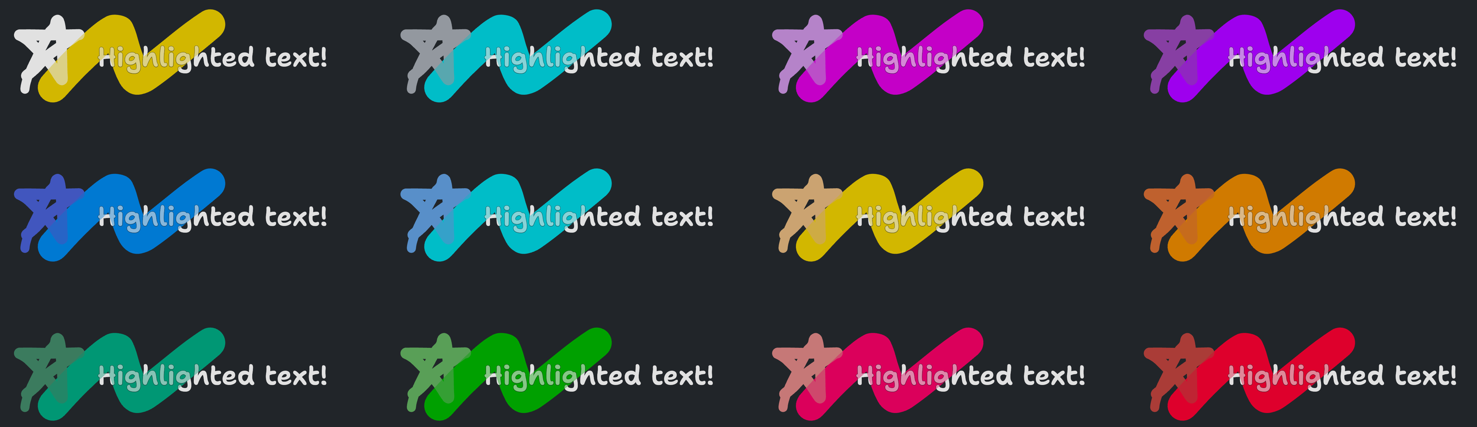
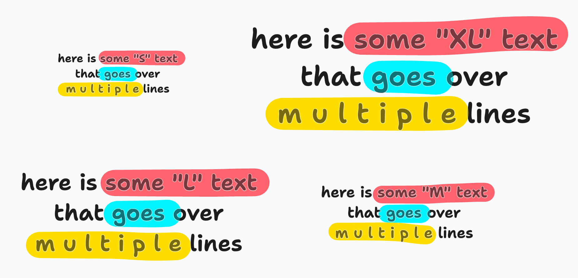
[3/3] Highlighter styling (#1490)
This PR finalises the highlighter shape with new colors, sizing, and
perfect freehand options.
The colors are based on our existing colour palette, but take advantage
of wide-gamut displays to make the highlighter highlightier. I used my
[oklch color palette tool to pick the
palette](https://alex.dytry.ch/toys/palette/?palette=%7B%22families%22:%5B%22black%22,%22grey%22,%22white%22,%22green%22,%22light-green%22,%22blue%22,%22light-blue%22,%22violet%22,%22light-violet%22,%22red%22,%22light-red%22,%22orange%22,%22yellow%22%5D,%22shades%22:%5B%22light-mode%22,%22dark-mode%22,%22hl-light%22,%22hl-dark%22%5D,%22colors%22:%5B%5B%5B0.2308,0,null%5D,%5B0.9097,0,null%5D,%5B0.2308,0,null%5D,%5B0.2308,0,null%5D%5D,%5B%5B0.7692,0.0145,248.02%5D,%5B0.6778,0.0118,256.72%5D,%5B0.7692,0.0145,248.02%5D,%5B0.7692,0.0145,248.02%5D%5D,%5B%5B1,0,null%5D,%5B0.2308,0,null%5D,%5B1,0,null%5D,%5B1,0,null%5D%5D,%5B%5B0.5851,0.1227,164.1%5D,%5B0.5319,0.0811,162.23%5D,%5B0.8729,0.2083,173.3%5D,%5B0.5851,0.152,173.3%5D%5D,%5B%5B0.7146,0.1835,146.44%5D,%5B0.6384,0.1262,143.36%5D,%5B0.8603,0.2438,140.11%5D,%5B0.6082,0.2286,140.11%5D%5D,%5B%5B0.5566,0.2082,268.35%5D,%5B0.4961,0.1644,270.65%5D,%5B0.7158,0.173,243.85%5D,%5B0.5573,0.178,243.85%5D%5D,%5B%5B0.718,0.1422,246.06%5D,%5B0.6366,0.1055,250.98%5D,%5B0.8615,0.1896,200.03%5D,%5B0.707,0.161,200.03%5D%5D,%5B%5B0.5783,0.2186,319.15%5D,%5B0.5043,0.1647,315.37%5D,%5B0.728,0.2001,307.45%5D,%5B0.5433,0.2927,307.45%5D%5D,%5B%5B0.7904,0.1516,319.77%5D,%5B0.6841,0.1139,315.99%5D,%5B0.812,0.21,327.8%5D,%5B0.5668,0.281,327.8%5D%5D,%5B%5B0.5928,0.2106,26.53%5D,%5B0.5112,0.1455,26.18%5D,%5B0.7326,0.21,20.59%5D,%5B0.554,0.2461,20.59%5D%5D,%5B%5B0.7563,0.146,21.1%5D,%5B0.6561,0.0982,20.86%5D,%5B0.7749,0.178,6.8%5D,%5B0.5565,0.2454,6.8%5D%5D,%5B%5B0.6851,0.1954,44.57%5D,%5B0.5958,0.1366,46.6%5D,%5B0.8207,0.175,68.62%5D,%5B0.6567,0.164,68.61%5D%5D,%5B%5B0.8503,0.1149,68.95%5D,%5B0.7404,0.0813,72.25%5D,%5B0.8939,0.2137,100.36%5D,%5B0.7776,0.186,100.36%5D%5D%5D%7D&selected=3).
I'm not sure happy about these colors as they are right now - in
particular, i think dark mode looks a bit rubbish and there are a few
colors where the highlight and original version are much too similar
(light-violet & light-red). Black uses yellow (like note shape) and grey
uses light-blue. Exports are forced into srgb color space rather than P3
for maximum compatibility.

The size of a highlighter stroke is now based on the text size which
works nicely for making the highlighter play well with text:
Perfect freehands settings are very similar to the draw tool, but with
the thinning turned way down. There is still some, but it's pretty
minimal.
### The plan
1. initial highlighter shape/tool #1401
2. sandwich rendering for highlighter shapes #1418
3. shape styling - new colours and sizes, lightweight perfect freehand
changes #1490 **>you are here<**
### Change Type
- [x] `minor` — New Feature
### Test Plan
1. You can find the highlighter tool in the extended toolbar
2. You can activate the highlighter tool by pressing shift-D
3. Highlighter draws nice and vibrantly when over the page background or
frame background
4. Highlighter is less vibrant but still visible when drawn over images
/ other fills
5. Highlighter size should nicely match the corresponding unscaled text
size
6. Exports with highlighter look as expected
### Release Notes
Highlighter pen is here! 🎉🎉🎉
---------
Co-authored-by: Steve Ruiz <steveruizok@gmail.com>
2023-06-01 15:34:59 +00:00
|
|
|
<DebugFlagToggle flag={debugFlags.forceSrgb} />
|
expanded highlighter geometry (#1929)
Currently, the highlighter shape uses a single 0-width line for its
geometry, same as the draw tool. For the draw tool this works ok - the
visual line is thin enough that unless you zoom right in, it's hard to
find areas where the hover should trigger but isn't. As the highlighter
tool is much thicker though, it's relatively easy to find those areas.
The fix is for the geometry to represent the line including its thick
stroke, instead of at 0-width. There are two possible approaches here:
1. Update the polyline geometry to allow passing a stroke width.
2. Instead of a polyline, make the highlighter shape be a polygon that
traces _around_ the stroke
1 is the more accurate approach, but is hard to fit into our geometry
system. Our geometry is based around two primitives: `getVertices` which
returns an array of points around the shape, and `nearestPoint` which
returns the nearest point on the geometry to a vector we pass in. We can
account for a stroke in `nearestPoint` pretty easily, including it in
`getVertices` is hard - we'd have to expand the vertices and handle line
join/caps etc. Just making the change in `nearestPoint` does fix the
issue here, but i'm not sure about the knock-on effect elsewhere and
don't really want to introduce 1-off hacks into the core geometry
system.
2 actually means addressing the same hard problem around outlining
strokes as 1, but it lets us do it in a more tightly-scoped one-off
change just to the highlighter shape, instead of trying to come up with
a generic solution for the whole geometry system. This is the approach
I've taken in this diff. We outline the stroke using perfect-freehand,
which works pretty well but produces inaccurate results at edge-cases,
particularly when a line rapidly changes direction:

I think that given this is scoped to just the highlighter shape and is
imo an improvement over the stroke issue from before, it's a reasonable
solution for now. If we want to in the future we could implement real
non-freehand-based outlining.
### Change Type
- [x] `patch` — Bug fix
### Test Plan
1. Create a highlight shape
2. Zoom in
3. Make sure you can interact with the shape at its edges instead of
right in the center
2023-09-26 11:21:37 +00:00
|
|
|
<DebugFlagToggle flag={debugFlags.debugGeometry} />
|
2023-10-06 08:57:46 +00:00
|
|
|
<DebugFlagToggle flag={debugFlags.hideShapes} />
|
2023-04-25 11:01:25 +00:00
|
|
|
</DropdownMenu.Group>
|
|
|
|
|
<DropdownMenu.Group>
|
Feature flags rework (#1474)
This diff tweaks our `debugFlags` framework to support setting different
default value for different environments, makes it easier to define
feature flags, and makes feature flags show up in the debug menu by
default. With this change, feature flags will default to being enabled
in dev and preview environments, but disabled in production.
Specify a feature flag like this:
```ts
const featureFlags = {
myCoolNewFeature: createFeatureFlag('myCoolNewFeature')
}
```
optionally, pass a second value to control its defaults:
```ts
const featureFlags = {
featureEnabledInProduction: createFeatureFlag('someFeature', { all: true }),
customEnabled: createFeatureFlag('otherFeature', {development: true, staging: false, production: false}),
}
```
In code, the value can be read using `featureFlags.myFeature.value`.
Remember to wrap reading it in a reactive context!
### Change Type
- [x] `patch` — Bug Fix
### Test Plan
-
### Release Notes
[internal only change]
2023-05-30 13:06:15 +00:00
|
|
|
{Object.values(featureFlags).map((flag) => {
|
|
|
|
|
return <DebugFlagToggle key={flag.name} flag={flag} />
|
|
|
|
|
})}
|
2023-04-25 11:01:25 +00:00
|
|
|
</DropdownMenu.Group>
|
|
|
|
|
{renderDebugMenuItems?.()}
|
|
|
|
|
</>
|
|
|
|
|
)
|
Feature flags rework (#1474)
This diff tweaks our `debugFlags` framework to support setting different
default value for different environments, makes it easier to define
feature flags, and makes feature flags show up in the debug menu by
default. With this change, feature flags will default to being enabled
in dev and preview environments, but disabled in production.
Specify a feature flag like this:
```ts
const featureFlags = {
myCoolNewFeature: createFeatureFlag('myCoolNewFeature')
}
```
optionally, pass a second value to control its defaults:
```ts
const featureFlags = {
featureEnabledInProduction: createFeatureFlag('someFeature', { all: true }),
customEnabled: createFeatureFlag('otherFeature', {development: true, staging: false, production: false}),
}
```
In code, the value can be read using `featureFlags.myFeature.value`.
Remember to wrap reading it in a reactive context!
### Change Type
- [x] `patch` — Bug Fix
### Test Plan
-
### Release Notes
[internal only change]
2023-05-30 13:06:15 +00:00
|
|
|
})
|
|
|
|
|
|
|
|
|
|
function Toggle({
|
|
|
|
|
label,
|
|
|
|
|
value,
|
|
|
|
|
onChange,
|
|
|
|
|
}: {
|
|
|
|
|
label: string
|
|
|
|
|
value: boolean
|
|
|
|
|
onChange: (newValue: boolean) => void
|
|
|
|
|
}) {
|
|
|
|
|
return (
|
2023-10-28 21:58:32 +00:00
|
|
|
<DropdownMenu.CheckboxItem
|
|
|
|
|
title={untranslated(label)}
|
|
|
|
|
checked={value}
|
|
|
|
|
onSelect={() => onChange(!value)}
|
|
|
|
|
>
|
|
|
|
|
<span className="tlui-button__label" draggable={false}>
|
|
|
|
|
{label}
|
|
|
|
|
</span>
|
Feature flags rework (#1474)
This diff tweaks our `debugFlags` framework to support setting different
default value for different environments, makes it easier to define
feature flags, and makes feature flags show up in the debug menu by
default. With this change, feature flags will default to being enabled
in dev and preview environments, but disabled in production.
Specify a feature flag like this:
```ts
const featureFlags = {
myCoolNewFeature: createFeatureFlag('myCoolNewFeature')
}
```
optionally, pass a second value to control its defaults:
```ts
const featureFlags = {
featureEnabledInProduction: createFeatureFlag('someFeature', { all: true }),
customEnabled: createFeatureFlag('otherFeature', {development: true, staging: false, production: false}),
}
```
In code, the value can be read using `featureFlags.myFeature.value`.
Remember to wrap reading it in a reactive context!
### Change Type
- [x] `patch` — Bug Fix
### Test Plan
-
### Release Notes
[internal only change]
2023-05-30 13:06:15 +00:00
|
|
|
</DropdownMenu.CheckboxItem>
|
|
|
|
|
)
|
2023-04-25 11:01:25 +00:00
|
|
|
}
|
|
|
|
|
|
Feature flags rework (#1474)
This diff tweaks our `debugFlags` framework to support setting different
default value for different environments, makes it easier to define
feature flags, and makes feature flags show up in the debug menu by
default. With this change, feature flags will default to being enabled
in dev and preview environments, but disabled in production.
Specify a feature flag like this:
```ts
const featureFlags = {
myCoolNewFeature: createFeatureFlag('myCoolNewFeature')
}
```
optionally, pass a second value to control its defaults:
```ts
const featureFlags = {
featureEnabledInProduction: createFeatureFlag('someFeature', { all: true }),
customEnabled: createFeatureFlag('otherFeature', {development: true, staging: false, production: false}),
}
```
In code, the value can be read using `featureFlags.myFeature.value`.
Remember to wrap reading it in a reactive context!
### Change Type
- [x] `patch` — Bug Fix
### Test Plan
-
### Release Notes
[internal only change]
2023-05-30 13:06:15 +00:00
|
|
|
const DebugFlagToggle = track(function DebugFlagToggle({
|
|
|
|
|
flag,
|
|
|
|
|
onChange,
|
|
|
|
|
}: {
|
|
|
|
|
flag: DebugFlag<boolean>
|
|
|
|
|
onChange?: (newValue: boolean) => void
|
|
|
|
|
}) {
|
|
|
|
|
return (
|
|
|
|
|
<Toggle
|
|
|
|
|
label={flag.name
|
|
|
|
|
.replace(/([a-z0-9])([A-Z])/g, (m) => `${m[0]} ${m[1].toLowerCase()}`)
|
|
|
|
|
.replace(/^[a-z]/, (m) => m.toUpperCase())}
|
2023-11-13 11:51:22 +00:00
|
|
|
value={flag.get()}
|
Feature flags rework (#1474)
This diff tweaks our `debugFlags` framework to support setting different
default value for different environments, makes it easier to define
feature flags, and makes feature flags show up in the debug menu by
default. With this change, feature flags will default to being enabled
in dev and preview environments, but disabled in production.
Specify a feature flag like this:
```ts
const featureFlags = {
myCoolNewFeature: createFeatureFlag('myCoolNewFeature')
}
```
optionally, pass a second value to control its defaults:
```ts
const featureFlags = {
featureEnabledInProduction: createFeatureFlag('someFeature', { all: true }),
customEnabled: createFeatureFlag('otherFeature', {development: true, staging: false, production: false}),
}
```
In code, the value can be read using `featureFlags.myFeature.value`.
Remember to wrap reading it in a reactive context!
### Change Type
- [x] `patch` — Bug Fix
### Test Plan
-
### Release Notes
[internal only change]
2023-05-30 13:06:15 +00:00
|
|
|
onChange={(newValue) => {
|
|
|
|
|
flag.set(newValue)
|
|
|
|
|
onChange?.(newValue)
|
|
|
|
|
}}
|
|
|
|
|
/>
|
|
|
|
|
)
|
|
|
|
|
})
|
|
|
|
|
|
2023-04-25 11:01:25 +00:00
|
|
|
function ExampleDialog({
|
|
|
|
|
title = 'title',
|
|
|
|
|
body = 'hello hello hello',
|
|
|
|
|
cancel = 'Cancel',
|
|
|
|
|
confirm = 'Continue',
|
|
|
|
|
displayDontShowAgain = false,
|
|
|
|
|
onCancel,
|
|
|
|
|
onContinue,
|
|
|
|
|
}: {
|
|
|
|
|
title?: string
|
|
|
|
|
body?: string
|
|
|
|
|
cancel?: string
|
|
|
|
|
confirm?: string
|
|
|
|
|
displayDontShowAgain?: boolean
|
|
|
|
|
onCancel: () => void
|
|
|
|
|
onContinue: () => void
|
|
|
|
|
}) {
|
|
|
|
|
const [dontShowAgain, setDontShowAgain] = React.useState(false)
|
|
|
|
|
|
|
|
|
|
return (
|
|
|
|
|
<>
|
|
|
|
|
<Dialog.Header>
|
|
|
|
|
<Dialog.Title>{title}</Dialog.Title>
|
|
|
|
|
<Dialog.CloseButton />
|
|
|
|
|
</Dialog.Header>
|
|
|
|
|
<Dialog.Body style={{ maxWidth: 350 }}>{body}</Dialog.Body>
|
|
|
|
|
<Dialog.Footer className="tlui-dialog__footer__actions">
|
|
|
|
|
{displayDontShowAgain && (
|
|
|
|
|
<Button
|
2023-10-28 21:58:32 +00:00
|
|
|
type="normal"
|
2023-04-25 11:01:25 +00:00
|
|
|
onClick={() => setDontShowAgain(!dontShowAgain)}
|
2023-10-28 21:58:32 +00:00
|
|
|
iconLeft={dontShowAgain ? 'check' : 'checkbox-empty'}
|
2023-04-25 11:01:25 +00:00
|
|
|
style={{ marginRight: 'auto' }}
|
|
|
|
|
>
|
|
|
|
|
{`Don't show again`}
|
|
|
|
|
</Button>
|
|
|
|
|
)}
|
2023-10-28 21:58:32 +00:00
|
|
|
<Button type="normal" onClick={onCancel}>
|
|
|
|
|
{cancel}
|
|
|
|
|
</Button>
|
2023-04-25 11:01:25 +00:00
|
|
|
<Button type="primary" onClick={async () => onContinue()}>
|
|
|
|
|
{confirm}
|
|
|
|
|
</Button>
|
|
|
|
|
</Dialog.Footer>
|
|
|
|
|
</>
|
|
|
|
|
)
|
|
|
|
|
}
|