7.7 KiB
Pie Charts in Plotly
A pie chart is a type of graph that represents the data in the circular graph. The slices of pie show the relative size of the data, and it is a type of pictorial representation of data. A pie chart requires a list of categorical variables and numerical variables. Here, the term "pie" represents the whole, and the "slices" represent the parts of the whole.
Pie charts are commonly used in business presentations like sales, operations, survey results, resources, etc. as they are pleasing to the eye and provide a quick summary.
Plotly is a very powerful library for creating modern visualizations and it provides a very easy and intuitive method to create highly customized pie charts.
Prerequisites
Before creating bar plots in Plotly you must ensure that you have Python, Plotly and Pandas installed on your system.
Introduction
There are various ways to create pie charts in plotly. One of the prominent and easiest one is using plotly.express. Plotly Express is the easy-to-use, high-level interface to Plotly, which operates on a variety of types of data and produces easy-to-style figures. On the other hand you can also use plotly.graph_objects to create various plots.
Here, we'll be using plotly.express to create the pie charts. Also we'll be converting our datasets into pandas DataFrames which makes it extremely convenient and easy to create charts.
Also, note that when you execute the codes in a simple python file, the output plot will be shown in your browser, rather than a pop-up window like in matplotlib. If you do not want that, it is recommended to create the plots in a notebook (like jupyter). For this, install an additional library nbformat. This way you can see the output on the notebook itself, and can also render its format to png, jpg, etc.
Creating a simple pie chart using plotly.express.pie
In plotly.express.pie, data visualized by the sectors of the pie is set in values. The sector labels are set in names.
import plotly.express as px
import pandas as pd

# Creating dataset
flowers = ['Rose','Tulip','Marigold','Sunflower','Daffodil']
petals = [11,9,17,4,7]

# Converting dataset to pandas DataFrame
dataset = {'flowers':flowers, 'petals':petals}
df = pd.DataFrame(dataset)

# Creating pie chart
fig = px.pie(df, values='petals', names='flowers')

# Showing plot
fig.show()

Here, we are first creating the dataset and converting it into Pandas DataFrames using dictionaries, with its keys being DataFrame columns. Next, we are plotting the pie chart by using px.pie. In the values and names parameters, we have to specify a column name in the DataFrame.
px.pie(df, values='Petals', names='Flowers') is used to specify that the pie chart is to be plotted by taking the values from column Petals and the fractional area of each slice is represented by petal/sum(petals). The column flowers represents the labels of slices corresponding to each value in petals.
Note: When you generate the image using above code, it will show you an interactive plot, if you want image, you can download it from their itself.
Customizing Pie Charts
Adding title to the chart
Simply pass the title of your chart as a parameter in px.pie.
import plotly.express as px
import pandas as pd

# Creating dataset
flowers = ['Rose','Tulip','Marigold','Sunflower','Daffodil']
petals = [11,9,17,4,7]

# Converting dataset to pandas DataFrame
dataset = {'flowers':flowers, 'petals':petals}
df = pd.DataFrame(dataset)

# Creating pie chart
fig = px.pie(df, values='petals', names='flowers',
             title='Number of Petals in Flowers')

# Showing plot
fig.show()

Coloring Slices
There are a lot of beautiful color scales available in plotly and can be found here plotly color scales. Choose your favourite colorscale apply it like this:
import plotly.express as px
import pandas as pd

# Creating dataset
flowers = ['Rose','Tulip','Marigold','Sunflower','Daffodil']
petals = [11,9,17,4,7]

# Converting dataset to pandas DataFrame
dataset = {'flowers':flowers, 'petals':petals}
df = pd.DataFrame(dataset)

# Creating pie chart
fig = px.pie(df, values='petals', names='flowers',
             title='Number of Petals in Flowers',
             color_discrete_sequence=px.colors.sequential.Agsunset)

# Showing plot
fig.show()

You can also set custom colors for each label by passing it as a dictionary(map) in color_discrete_map, like this:
import plotly.express as px
import pandas as pd

# Creating dataset
flowers = ['Rose','Tulip','Marigold','Sunflower','Daffodil']
petals = [11,9,17,4,7]

# Converting dataset to pandas DataFrame
dataset = {'flowers':flowers, 'petals':petals}
df = pd.DataFrame(dataset)

# Creating pie chart
fig = px.pie(df, values='petals', names='flowers',
             title='Number of Petals in Flowers',
             color='flowers',
             color_discrete_map={'Rose':'red',
                                 'Tulip':'magenta',
                                 'Marigold':'green',
                                 'Sunflower':'yellow',
                                 'Daffodil':'royalblue'})

# Showing plot
fig.show()

Labeling Slices
You can use fig.update_traces to effectively control the properties of text being displayed on your figure, for example if we want both flower name , petal count and percentage in our slices, we can do it like this:
import plotly.express as px
import pandas as pd

# Creating dataset
flowers = ['Rose','Tulip','Marigold','Sunflower','Daffodil']
petals = [11,9,17,4,7]

# Converting dataset to pandas DataFrame
dataset = {'flowers':flowers, 'petals':petals}
df = pd.DataFrame(dataset)

# Creating pie chart
fig = px.pie(df, values='petals', names='flowers',
             title='Number of Petals in Flowers')

# Updating text properties
fig.update_traces(textposition='inside', textinfo='label+value+percent')

# Showing plot
fig.show()

Pulling out a slice
To pull out a slice pass an array to parameter pull in fig.update_traces corresponding to the slices and amount to be pulled.
import plotly.express as px
import pandas as pd

# Creating dataset
flowers = ['Rose','Tulip','Marigold','Sunflower','Daffodil']
petals = [11,9,17,4,7]

# Converting dataset to pandas DataFrame
dataset = {'flowers':flowers, 'petals':petals}
df = pd.DataFrame(dataset)

# Creating pie chart
fig = px.pie(df, values='petals', names='flowers',
             title='Number of Petals in Flowers')

# Updating text properties
fig.update_traces(textposition='inside', textinfo='label+value')

# Pulling out slice
fig.update_traces(pull=[0,0,0,0.2,0])

# Showing plot
fig.show()

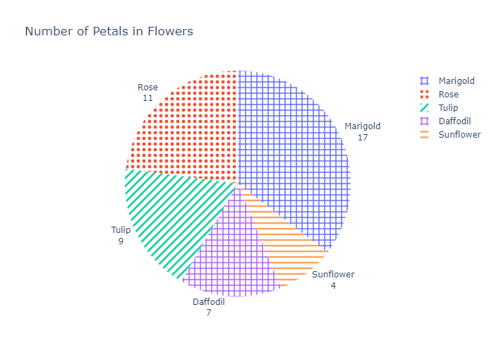
Pattern Fills
You can also add patterns (hatches), in addition to colors in pie charts.
import plotly.express as px
import pandas as pd

# Creating dataset
flowers = ['Rose','Tulip','Marigold','Sunflower','Daffodil']
petals = [11,9,17,4,7]

# Converting dataset to pandas DataFrame
dataset = {'flowers':flowers, 'petals':petals}
df = pd.DataFrame(dataset)

# Creating pie chart
fig = px.pie(df, values='petals', names='flowers',
             title='Number of Petals in Flowers')

# Updating text properties
fig.update_traces(textposition='outside', textinfo='label+value')

# Adding pattern fills
fig.update_traces(marker=dict(pattern=dict(shape=[".", "/", "+", "-","+"])))

# Showing plot
fig.show()