6.4 KiB
Line Chart in Matplotlib
A line chart is a simple way to visualize data where we connect individual data points. It helps us to see trends and patterns over time or across categories.
This type of chart is particularly useful for:
- Comparing Data: Comparing multiple datasets on the same axes.
- Highlighting Changes: Illustrating changes and patterns in data.
- Visualizing Trends: Showing trends over time or other continuous variables.
Prerequisites
Line plots can be created in Python with Matplotlib's pyplot library. To build a line plot, first import matplotlib. It is a standard convention to import Matplotlib's pyplot library as plt.
import matplotlib.pyplot as plt
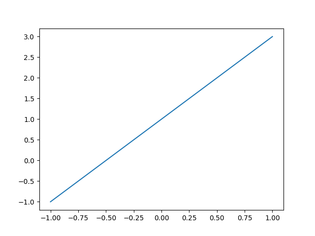
Creating a simple Line Plot
First import matplotlib and numpy, these are useful for charting.
You can use the plot(x,y) method to create a line chart.
import matplotlib.pyplot as plt
import numpy as np

x = np.linspace(-1, 1, 50)
print(x)
y = 2*x + 1

plt.plot(x, y)
plt.show()
When executed, this will show the following line plot:
Curved line
The plot() method also works for other types of line charts. It doesn’t need to be a straight line, y can have any type of values.
import matplotlib.pyplot as plt
import numpy as np

x = np.linspace(-1, 1, 50)
y = 2**x + 1

plt.plot(x, y)
plt.show()
When executed, this will show the following Curved line plot:

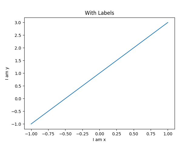
Line with Labels
To know what you are looking at, you need meta data. Labels are a type of meta data. They show what the chart is about. The chart has an x label, y label and title.
import matplotlib.pyplot as plt
import numpy as np

x = np.linspace(-1, 1, 50)
y1 = 2*x + 1
y2 = 2**x + 1

plt.figure()
plt.plot(x, y1)

plt.xlabel("I am x")
plt.ylabel("I am y")
plt.title("With Labels")

plt.show()
When executed, this will show the following line with labels plot:
Multiple lines
More than one line can be in the plot. To add another line, just call the plot(x,y) function again. In the example below we have two different values for y(y1,y2) that are plotted onto the chart.
import matplotlib.pyplot as plt
import numpy as np

x = np.linspace(-1, 1, 50)
y1 = 2*x + 1
y2 = 2**x + 1

plt.figure(num = 3, figsize=(8, 5))
plt.plot(x, y2)
plt.plot(x, y1,
         color='red',
         linewidth=1.0,
         linestyle='--'
        )

plt.show()
When executed, this will show the following Multiple lines plot:

Dotted line
Lines can be in the form of dots like the image below. Instead of calling plot(x,y) call the scatter(x,y) method. The scatter(x,y) method can also be used to (randomly) plot points onto the chart.
import matplotlib.pyplot as plt
import numpy as np

n = 1024
X = np.random.normal(0, 1, n)
Y = np.random.normal(0, 1, n)
T = np.arctan2(X, Y)

plt.scatter(np.arange(5), np.arange(5))

plt.xticks(())
plt.yticks(())

plt.show()
When executed, this will show the following Dotted line plot:

Line ticks
You can change the ticks on the plot. Set them on the x-axis, y-axis or even change their color. The line can be more thick and have an alpha value.
import matplotlib.pyplot as plt
import numpy as np

x = np.linspace(-1, 1, 50)
y = 2*x - 1

plt.figure(figsize=(12, 8))
plt.plot(x, y, color='r', linewidth=10.0, alpha=0.5)

ax = plt.gca()

ax.spines['right'].set_color('none')
ax.spines['top'].set_color('none')

ax.xaxis.set_ticks_position('bottom')
ax.yaxis.set_ticks_position('left')

ax.spines['bottom'].set_position(('data', 0))
ax.spines['left'].set_position(('data', 0))

for label in ax.get_xticklabels() + ax.get_yticklabels():
    label.set_fontsize(12)
    label.set_bbox(dict(facecolor='y', edgecolor='None', alpha=0.7))

plt.show()
When executed, this will show the following line ticks plot:

Line with asymptote
An asymptote can be added to the plot. To do that, use plt.annotate(). There’s lso a dotted line in the plot below. You can play around with the code to see how it works.
import matplotlib.pyplot as plt
import numpy as np

x = np.linspace(-1, 1, 50)
y1 = 2*x + 1
y2 = 2**x + 1

plt.figure(figsize=(12, 8))
plt.plot(x, y2)
plt.plot(x, y1, color='red', linewidth=1.0, linestyle='--')

ax = plt.gca()

ax.spines['right'].set_color('none')
ax.spines['top'].set_color('none')

ax.xaxis.set_ticks_position('bottom')
ax.yaxis.set_ticks_position('left')

ax.spines['bottom'].set_position(('data', 0))
ax.spines['left'].set_position(('data', 0))


x0 = 1
y0 = 2*x0 + 1

plt.scatter(x0, y0, s = 66, color = 'b')
plt.plot([x0, x0], [y0, 0], 'k-.', lw= 2.5)

plt.annotate(r'$2x+1=%s$' %
             y0,
             xy=(x0, y0),
             xycoords='data',

             xytext=(+30, -30),
             textcoords='offset points',
             fontsize=16,
             arrowprops=dict(arrowstyle='->',connectionstyle='arc3,rad=.2')
            )

plt.text(0, 3,
         r'$This\ is\ a\ good\ idea.\ \mu\ \sigma_i\ \alpha_t$',
         fontdict={'size':16,'color':'r'})

plt.show()
When executed, this will show the following Line with asymptote plot:

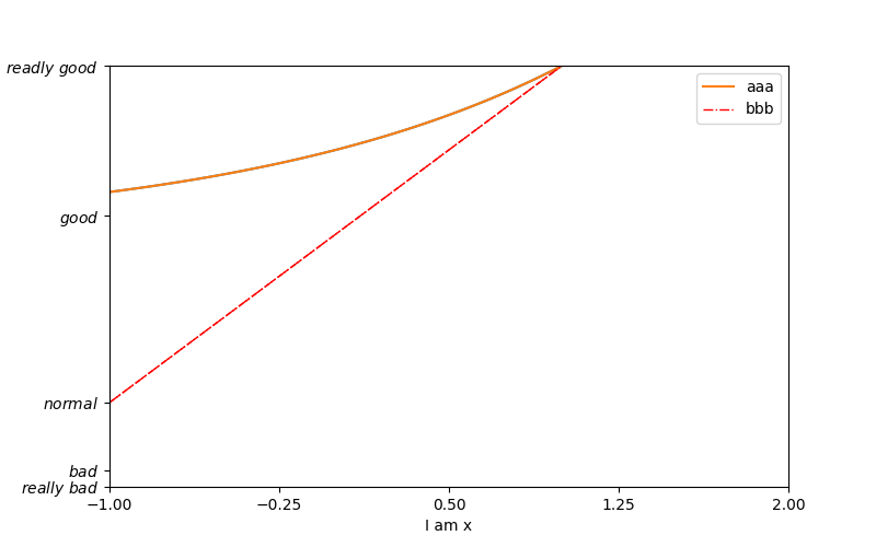
Line with text scale
It doesn’t have to be a numeric scale. The scale can also contain textual words like the example below. In plt.yticks() we just pass a list with text values. These values are then show against the y axis.
import matplotlib.pyplot as plt
import numpy as np

x = np.linspace(-1, 1, 50)
y1 = 2*x + 1
y2 = 2**x + 1

plt.figure(num = 3, figsize=(8, 5))
plt.plot(x, y2)

plt.plot(x, y1,
         color='red',
         linewidth=1.0,
         linestyle='--'
        )

plt.xlim((-1, 2))
plt.ylim((1, 3))

new_ticks = np.linspace(-1, 2, 5)
plt.xticks(new_ticks)
plt.yticks([-2, -1.8, -1, 1.22, 3],
          [r'$really\ bad$', r'$bad$', r'$normal$', r'$good$', r'$readly\ good$'])

ax = plt.gca()
ax.spines['right'].set_color('none')
ax.spines['top'].set_color('none')

ax.xaxis.set_ticks_position('bottom')
ax.yaxis.set_ticks_position('left')

ax.spines['bottom'].set_position(('data', 0))
ax.spines['left'].set_position(('data', 0))

plt.show()
When executed, this will show the following Line with text scale plot: