# Card
[component-header:sl-card]
Cards can be used to group related subjects in a container.
```html preview
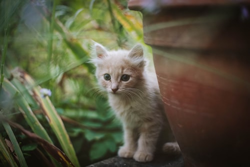 Mittens
This kitten is as cute as he is playful. Bring him home today!
6 weeks old
More Info
```
```jsx react
import { SlButton, SlCard, SlRating } from '@shoelace-style/shoelace/dist/react';
const css = `
.card-overview {
max-width: 300px;
}
.card-overview small {
color: var(--sl-color-neutral-500);
}
.card-overview [slot="footer"] {
display: flex;
justify-content: space-between;
align-items: center;
}
`;
const App = () => (
<>
Mittens
This kitten is as cute as he is playful. Bring him home today!
6 weeks old
More Info
);
```
## Examples
## Basic Card
Basic cards aren't very exciting, but they can display any content you want them to.
```html preview
This is just a basic card. No image, no header, and no footer. Just your content.
```
```jsx react
import { SlCard } from '@shoelace-style/shoelace/dist/react';
const css = `
.card-basic {
max-width: 300px;
}
`;
const App = () => (
<>
This is just a basic card. No image, no header, and no footer. Just your content.
);
```
## Card with Header
Headers can be used to display titles and more.
```html preview
```
```jsx react
import { SlCard, SlIconButton } from '@shoelace-style/shoelace/dist/react';
const css = `
.card-header {
max-width: 300px;
}
.card-header [slot="header"] {
display: flex;
align-items: center;
justify-content: space-between;
}
.card-header h3 {
margin: 0;
}
.card-header sl-icon-button {
font-size: var(--sl-font-size-medium);
}
`;
const App = () => (
<>
Header Title
This card has a header. You can put all sorts of things in it!
);
```
## Card with Footer
Footers can be used to display actions, summaries, or other relevant content.
```html preview
```
```jsx react
import { SlButton, SlCard, SlRating } from '@shoelace-style/shoelace/dist/react';
const css = `
.card-footer {
max-width: 300px;
}
.card-footer [slot="footer"] {
display: flex;
justify-content: space-between;
align-items: center;
}
`;
const App = () => (
<>
This card has a footer. You can put all sorts of things in it!
Preview
);
```
## Images
Cards accept an `image` slot. The image is displayed atop the card and stretches to fit.
```html preview
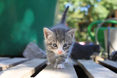 This is a kitten, but not just any kitten. This kitten likes walking along pallets.
```
```jsx react
import { SlCard } from '@shoelace-style/shoelace/dist/react';
const css = `
.card-image {
max-width: 300px;
}
`;
const App = () => (
<>
This is a kitten, but not just any kitten. This kitten likes walking along pallets.
);
```
[component-metadata:sl-card]
This is a kitten, but not just any kitten. This kitten likes walking along pallets.
```
```jsx react
import { SlCard } from '@shoelace-style/shoelace/dist/react';
const css = `
.card-image {
max-width: 300px;
}
`;
const App = () => (
<>
This is a kitten, but not just any kitten. This kitten likes walking along pallets.
);
```
[component-metadata:sl-card]