 11183db83f
|
||
|---|---|---|
| drivers | ||
| gui | ||
| images | ||
| setup_examples | ||
| .gitignore | ||
| LICENSE | ||
| README.md | ||
| hardware_setup.py | ||
README.md
micropython-micro-gui
This is a lightweight, portable, MicroPython GUI library for displays with
drivers subclassed from framebuf. It allows input via pushbuttons or via a
switch joystick.
It is larger and more complex than nano-gui owing to the support for input.
It enables switching between screens and launching modal windows. In addition
to nano-gui widgets it supports listboxes, dropdown lists, various means of
entering or displaying floating point values, and other widgets.
It is compatible with all display drivers for nano-gui so is portable to a wide range of displays. It is also portable between hosts.
Project status
Code has been tested on ESP32 and Pi Pico. It is new and bugs are likely. This document is also incomplete and under review.
0. Contents
TODO
1. Basic concepts
Internally micro-gui uses uasyncio. It presents a conventional callback
based interface; knowledge of uasyncio is not required for its use. Display
refresh is handled automatically. As in nano-gui, widgets are drawn using
graphics primitives rather than icons. This makes them efficiently scalable and
minimises RAM usage compared to icon-based graphics. It also facilitates the
provision of extra visual information. For example the color of all or part of
a widget may be changed programmatically, for example to highlight an overrange
condition.
1.1 Coordinates
These are defined as row and col values where row==0 and col==0
corresponds to the top left most pixel. Rows increase downwards and columns
increase to the right. The graph plotting widget uses normal mathematical
conventions within graphs.
1.2 Screen, Window and Widget objects
A Screen is a window which occupies the entire display. A Screen can
overlay another, replacing all its contents. When closed, the Screen below is
re-displayed.
A Window is a subclass of Screen but is smaller, with size and location
attributes. It can overlay part of an underlying Screen and is typically used
for modal dialog boxes.
A Widget is an object capable of displaying data. Some are also capable of
data input. The latter can be capable of accepting focus, see
navigation. Widget objects have dimensions
defined as height and width. The space requred by them exceeds these by two
pixels all round, as a white border is drawn to show which object currently has
focus. Thus to place a Widget at the extreme top left, row and col values
should be 2.
1.3 Fonts
Python font files are in the gui/fonts directory. The easiest way to conserve
RAM is to freeze them which is highly recommended. In doing so the directory
structure must be maintained.
To create alternatives, Python fonts may be generated from industry standard
font files with
font_to_py.py. The
-x option for horizontal mapping must be specified. If fixed pitch rendering
is required -f is also required. Supplied examples are:
arial10.pyVariable pitch Arial. 10 pixels high.arial35.pyArial 35 high.arial_50.pyArial 50 high.courier20.pyFixed pitch Courier, 20 high.font6.pyFreeSans 14 high.font10.pyFreeSans 17 high.freesans20.pyFreeSans 20 high.
1.4 Navigation
The GUI requires from 2 to 5 pushbuttons for control. These are:
NextMove to the next widget.SelectOperate the currently selected widget.PrevMove to the previous widget.IncreaseMove within the widget.DecreaseMove within the widget.
Many widgets such as Pushbutton or Checkbox objects require only the
Select button to operate: it is possible to design an interface using only
the first two buttons.
Widgets such as Listbox objects, dropdown lists (Dropdown), and those for
floating point data entry require the Increase and Decrease buttons to move
within the widget or to adjust the linear value.
A LinearIO is a Widget that responds to the increase and decrease
buttons by running an asyncio task. These typically output floating point
values using an accelerating algorithm responding to the duration of the button
press. This enables floats with a wide dynamic range to be adjusted with
precision.
The currently selected Widget is identified by a white border: the focus
moves between widgets via Next and Prev. Only Widget instances that can
accept input can receive the focus; such widgets are defined as active.
Widgets are defined as active or passive in the constructor, and this status
cannot be changed. In some cases the state can be specified as a constructor
arg. An active widget can be disabled and re-enabled at runtime. A disabled
active widget is shown "greyed-out" and, until enabled, cannot accept the
focus.
1.5 Hardware definition
A file hardware_setup.py must exist in the GUI root directory. This defines
the connections to the display, the display driver, and pins used for the
pushbuttons. Example files may be found in the setup_examples directory.
Display drivers are documented here.
1.6 Installation
The easy way to start is to use mpremote which allows a directory on your PC
to be mounted on the host. In this way the filesystem on the host is left
unchanged. This is at some cost in loading speed, especially on ESP32. If
adopting this approach, you will need to ensure the hardware_setup.py file on
the PC matches your hardware. Install mpremote with
$ pip3 install mpremote
Clone the repo to your PC with
$ git clone https://github.com/peterhinch/micropython-micro-gui
$ cd micropython-micro-gui
Edit hardware_setup.py then run:
$ mpremote mount .
This should provide a REPL. Run the minimal demo:
>>> import gui.demos.simple
If installing to the device's filesystem it is necessary to maintain the
directory structure. The drivers and gui directories (with subdirectories
and contents) should be copied, along with hardware_setup.py. Filesystem
space may be conserved by copying only the display driver in use. Unused
widgets, fonts and demos can also be trimmed, but directory structure must be
kept.
There is scope for speeding loading and saving RAM by using frozen bytecode. Once again, directory structure must be maintained.
1.7 Quick hardware check
The following may be pasted at the REPL to verify correct connection to the
display. It also confirms that hardware_setup.py is specifying a suitable
display driver.
from hardware_setup import ssd  # Create a display instance
from gui.core.colors import *
ssd.fill(0)
ssd.line(0, 0, ssd.width - 1, ssd.height - 1, GREEN)  # Green diagonal corner-to-corner
ssd.rect(0, 0, 15, 15, RED)  # Red square at top left
ssd.rect(ssd.width -15, ssd.height -15, 15, 15, BLUE)  # Blue square at bottom right
ssd.show()
1.8 Performance and hardware notes
The largest supported display is a 320x240 ILI9341 unit. On a Pi Pico with no use of frozen bytecode the demos run with over 74K of free RAM. Substantial improvements could be achieved using frozen bytecode.
Snappy navigation benefits from several approaches:
- Clocking the SPI bus as fast as possible.
- Clocking the host fast (
machine.freq). - Device driver support for
uasyncio. Currently this exists on ILI9341 and ST7789 (e.g. TTGO T-Display). I intend to extend this to other drivers.
On ESP32 I found it necessary to use physical pullup resistors on the pushbutton GPIO lines.
1.9 Firmware and dependencies
Firmware should be V1.15 or later.
The source tree includes all dependencies. These are listed to enable users to check for newer versions:
- writer.py Provides text rendering of Python font files.
A copy of the official driver for OLED displays using the SSD1306 chip is provided. The official file is here:
Displays based on the Nokia 5110 (PCD8544 chip) require this driver. It is not in this repo but may be found here:
Synchronisation primitives for uasyncio may be found here:
1.10 Supported hosts and displays
Development was done using a Raspberry Pi Pico connected to a cheap ILI9341
320x240 display. I have also tested a TTGO T-Display (an ESP32 host) and a
Pyboard. Code is written with portability as an aim, but MicroPython configs
vary between platforms and I can't guarantee that every widget will work on
every platform. For example, some use the cmath module which may be absent on
some builds.
Supported displays are as per the nano-gui list. In practice usage with ePaper displays is questionable because of their slow refresh times. I haven't tested these, or the Sharp displays.
Display drivers are documented here.
1.11 Files
Display drivers may be found in the drivers directory. These are copies of
those in nano-gui, included for convenience.
The system is organised as a Python package with the root being gui. Core
files in gui/core are:
colors.pyConstants including colors and shapes.ugui.pyThe main GUI code.writer.pySupports theWriterandCWriterclasses.
The gui/primitives directory contains the following files:
switch.pyInterface to physical pushbuttons.delay_ms.pyA software triggerable timer.
The gui/demos directory contains a variety of demos and tests, some of which
require a large (320x240) display. Demos are run by issuing (for example):
>>> import gui.demos.simple
simple.pyMinimal demo discussed below.active.pyDemonstratesactivecontrols providing floating point input.plot.pyGraph plotting.screens.pyListbox, dropdown and dialog boxes.tbox.pyText boxes and user-controlled scrolling.various.pyAssorted widgets including the different types of pushbutton.vtest.pyClock and compass styles of vector display.
2. Usage
2.1 Program structure and operation
The following is a minimal script (found in gui.demos.simple.py) which will
run on a minimal system with a small display and two pushbuttons. It provides
two Button widgets with "Yes" and "No" legends.
It may be run by issuing at the REPL:
>>> import gui.demos.simple
Note that the import of hardware_setup.py is the first line of code. This is
because the frame buffer is created here, with a need for a substantial block
of contiguous RAM.
from hardware_setup import ssd  # Create a display instance
from gui.core.ugui import Screen

from gui.widgets.label import Label
from gui.widgets.buttons import Button, CloseButton
from gui.core.writer import CWriter

# Font for CWriter
import gui.fonts.arial10 as arial10
from gui.core.colors import *


class BaseScreen(Screen):

    def __init__(self):

        def my_callback(button, arg):
            print('Button pressed', arg)

        super().__init__()
        wri = CWriter(ssd, arial10, GREEN, BLACK, verbose=False)

        col = 2
        row = 2
        Label(wri, row, col, 'Simple Demo')
        row = 20
        Button(wri, row, col, text='Yes', callback=my_callback, args=('Yes',))
        col += 60
        Button(wri, row, col, text='No', callback=my_callback, args=('No',))
        CloseButton(wri)  # Quit the application

def test():
    print('Testing micro-gui...')
    Screen.change(BaseScreen)

test()
Note how the Next pushbutton moves the focus between the two buttons and the
"X" close button. The focus does not move to the "Simple Demo" widget because
it is not active: a Label cannot accept user input. Pushing the Select
pushbutton while the focus is on a Pushbutton causes the callback to run.
Applications start by performing Screen.change() to a user-defined Screen
object. This must be subclassed from the GUI's Screen class. Note that
Screen.change accepts a class name, not a class instance.
The user defined BaseScreen class constructor instantiates all widgets to be
displayed and typically associates them with callback functions - which may be
bound methods. Screens typically have a CloseButton widget. This is a special
Pushbutton subclass which displays as an "X" at the top right corner of the
physical display and closes the current screen, showing the one below. If used
on the bottom level Screen (as above) it closes the application.
The wri instance of CWriter associates a widget with a font. Constructors
for all widgets have three mandatory positional args. These are a CWriter
instance followed by row and col. These args are followed by a number of
optional keyword args. These have (hopefully) sensible defaults enabling you to
get started easily.
2.2 Callbacks
The interface is event driven. Widgets may have optional callbacks which will
be executed when a given event occurs. Events occur when a widget's properties
are changed programmatically, and also (in the case of active widgets) in
response to user input.
A callback function receives positional arguments. The first is a reference to the object raising the callback. Subsequent arguments are user defined, and are specified as a tuple or list of items. Callbacks and their argument lists are optional: a default null function and empty list are provided. Callbacks may optionally be written as bound methods. This facilitates communication between widgets.
When writing callbacks take care to ensure that the number of arguments passed is correct, bearing in mind the first arg listed above. Failure to do this will result in tracebacks which implicate the GUI code rather than the buggy user code: this is because the GUI runs the callbacks.
2.3 Colors
The file gui/core/colors.py defines standard color constants which may be
used with any display driver. This section describes how to change these or
to create additional colors.
Most of the color display drivers define colors as 8-bit or larger values. In such cases colors may be created and assigned to variables as follows:
from hardware_setup import ssd
PALE_YELLOW = ssd.rgb(150, 150, 0)
The GUI also provides drivers with 4-bit color to minimise RAM use. Colors are assigned to a lookup table having 16 entries. The frame buffer stores 4-bit color values, which are converted to the correct color depth for the hardware when the display is refreshed.
Of the possible 16 colors 13 are assigned in gui/core/colors.py, leaving
color numbers 12, 13 and 14 free. Any color can be assigned as follows:
from gui.core.colors import *  # Imports the create_color function
PALE_YELLOW = create_color(12, 150, 150, 0)
This creates a color rgb(150, 150, 0) assigns it to "spare" color number 12
then sets PALE_YELLOW to 12. Any color number in range 0 <= n <= 15 may be
used (implying that predefined colors may be reassigned). It is recommended
that BLACK (0) and WHITE (15) are not changed. If code is to be ported
between 4-bit and other drivers, use create_color() for all custom colors:
it will produce appropriate behaviour. For an example see the nano-gui demo
color15.py - in particular the vari_fields function.
2.3.1 Monochrome displays
Most widgets work on monochrome displays if color settings are left at default values. If a color is specified, drivers in this repo will convert it to black or white depending on its level of saturation. A low level will produce the background color, a high level the foreground.
At the bit level 1 represents the foreground. This is white on an emitting
display such as an OLED. On a Sharp display it indicates reflection.
There is an issue regarding ePaper displays discussed here. I don't consider ePaper displays as suitable for I/O because of their slow refresh time.
3. Class details
4. Screen class
The Screen class presents a full-screen canvas onto which displayable
objects are rendered. Before instantiating widgets a Screen instance must be
created. This will be current until another is instantiated. When a widget is
instantiated it is associated with the current screen.
All applications require the creation of at least one user screen. This is done
by subclassing the Screen class. Widgets are instantiated in the constructor.
Widgets may be assigned to bound variable: this facilitates communication
between them.
4.1 Class methods
In normal use the following methods only are required:
change(cls, cls_new_screen, *, forward=True, args=[], kwargs={})Change screen, refreshing the display. Mandatory positional argument: the new screen class name. This must be a class subclassed fromScreen. The class will be instantiated and displayed. Optional keyword argumentsargs,kwargsenable passing positional and keyword arguments to the constructor of the new, user defined, screen.back(cls)Restore previous screen.
These are uncommon:__
shutdown(cls)Clear the screen and shut down the GUI. Normally done by aCloseButtoninstance.show(cls, force). This causes the screen to be redrawn. IfforceisFalseunchanged widgets are not refreshed. IfTrue, all visible widgets are re-drawn. Explicit calls to this should never be needed.
See demos/plot.py for an example of multi-screen design.
4.2 Constructor
This takes no arguments.
4.3 Callback methods
These are null functions which may be redefined in user subclasses.
on_open(self)Called when a screen is instantiated but prior to display.after_open(self)Called after a screen has been displayed.on_hide(self)Called when a screen ceases to be current.
See demos/plot.py for examples of usage of after_open.
4.4 Method
reg_task(self, task, on_change=False)The first arg may be aTaskinstance or a coroutine.
This is a convenience method which provides for the automatic cancellation of
tasks. If a screen runs independent coros it can opt to register these. If the
screen is overlaid by another, tasks registered with on_change True are
cancelled. If the screen is closed, all tasks registered to it are cancelled
regardless of the state of on_change. On shudown, any tasks registered to the
base screen are cancelled.
For finer control applications can ignore this method and handle cancellation explicitly in code.
5. Window class
This is a Screen subclass providing for modal windows. As such it has
positional and dimension information. Usage consists of writing a user class
subclassed from Window. Example code is in demos/screens.py.
5.2 Constructor
This takes the following positional args:
rowcolheightwidth
Followed by keyword-only args
draw_border=Truebgcolor=NoneBackground color, default black.fgcolor=NoneForeground color, default white.
5.3 Class method
value(cls, val=None)Thevalarg can be any Python type. It allows widgets on aWindowto store information in a way which can be accessed from the calling screen. This typically occurs after the window has closed and no longer exists as an instance.
Another approach, demonstrated in demos/screens.py, is to pass one or more
callbacks to the user window constructor args. These may be called by widgets
to send data to the calling screen. Note that widgets on the screen below will
not be updated until the window has closed.
6. Label widget
from gui.widgets.label import Label

Two styles of Label.
The purpose of a Label instance is to display text at a specific screen
location.
Text can be static or dynamic. In the case of dynamic text the background is cleared to ensure that short strings cleanly replace longer ones.
Labels can be displayed with an optional single pixel border.
Colors are handled flexibly. By default the colors used are those of the
Writer instance, however they can be changed dynamically; this might be used
to warn of overrange or underrange values. The color15.py demo illustrates
this.
Constructor args:
writerTheWriterinstance (font and screen) to use.rowLocation on screen.coltextIf a string is passed it is displayed: typically used for static text. If an integer is passed it is interpreted as the maximum text length in pixels; typically obtained fromwriter.stringlen('-99.99'). Nothing is dsplayed until.value()is called. Intended for dynamic text fields.invert=FalseDisplay in inverted or normal style.fgcolor=NoneColor of foreground (the control itself). IfNonetheWriterforeground default is used.bgcolor=NoneBackground color of object. IfNonetheWriterbackground default is used.bdcolor=FalseColor of border. IfFalseno border will be drawn. IfNonethefgcolorwill be used, otherwise a color may be passed. If a color is available, a border line will be drawn around the control.
The constructor displays the string at the required location.
Methods:
valueRedraws the label. This takes the following args:text=NoneThe text to display. IfNonedisplays last value.invert=FalseIf true, show inverse text.fgcolor=NoneForeground color: ifNonetheWriterdefault is used.bgcolor=NoneBackground color, as per foreground.bdcolor=NoneBorder color. As per above except that ifFalseis passed, no border is displayed. This clears a previously drawn border.
Returns the current text string.
showNo args. (Re)draws the label. Primarily for internal use by GUI.
If populating a label would cause it to extend beyond the screen boundary a warning is printed at the console. The label may appear at an unexpected place. The following is a complete "Hello world" script.
from hardware_setup import ssd  # Create a display instance
from gui.core.ugui import Screen
from gui.core.writer import CWriter
from gui.core.colors import *

from gui.widgets.label import Label
from gui.widgets.buttons import CloseButton
import gui.fonts.freesans20 as freesans20


class BaseScreen(Screen):

    def __init__(self):
        super().__init__()
        wri = CWriter(ssd, freesans20, GREEN, BLACK, verbose=False)
        Label(wri, 2, 2, 'Hello world!')
        CloseButton(wri)

Screen.change(BaseScreen)
7. LED widget
from gui.widgets.led import LED
This is a virtual LED whose color may be altered dynamically.
Constructor mandatory positional args:
writerTheWriterinstance (defines font) to use.rowLocation on screen.col
Keyword only args:
height=12Height of LED.fgcolor=NoneColor of foreground (the control itself). IfNonetheWriterforeground default is used.bgcolor=NoneBackground color of object. IfNonetheWriterbackground default is used.bdcolor=FalseColor of border. IfFalseno border will be drawn. If a color is provided, a border line will be drawn around the control. shown in the foreground color. If a color is passed, it is used.label=NoneA text string will cause aLabelto be drawn below the LED. An integer will create aLabelof that width for later use.
Methods:
colorargc=NoneChange the LED color toc. IfcisNonethe LED is turned off (rendered in the background color).textUpdates the label if present (otherwise throws aValueError). Args:text=NoneThe text to display. IfNonedisplays last value.invert=FalseIf true, show inverse text.fgcolor=NoneForeground color: ifNonetheWriterdefault is used.bgcolor=NoneBackground color, as per foreground.bdcolor=NoneBorder color. As per above except that ifFalseis passed, no border is displayed. This clears a previously drawn border.
showNo args. (Re)draws the LED. Primarily for internal use by GUI.
8. Checkbox widget
from gui.widgets.checkbox import Checkbox
This provides for Boolean data entry and display. In the True state the
control can show an 'X' or a filled block of any color.
Constructor mandatory positional args:
writerTheWriterinstance (defines font) to use.rowLocation on screen.col
Optional keyword only arguments:
height=30Dimension of the square bounding box. Default 30 pixels.fillcolor=NoneFill color of checkbox whenTrue. IfNonean 'X' will be drawn.fgcolor=NoneColor of foreground (the control itself). IfNonetheWriterforeground default is used.bgcolor=NoneBackground color of object. IfNonetheWriterbackground default is used.bdcolor=FalseColor of border. IfFalseno border will be drawn. If a color is provided, a border line will be drawn around the control.callback=dolittleCallback function which will run when the value changes. The default is a null function.args=[]A list/tuple of arguments for above callback.value=FalseInitial value.active=TrueBy default user input is accepted.
Methods:
greyed_outOptional Boolean argumentvaldefaultNone. IfNonereturns the current 'greyed out' status of the control. Otherwise, if the widget isactive, enables or disables it, showing it in its new state.valueOptional Boolean argumentval. If the provided value does not correspond to the control's current value, updates it; the checkbox is re-drawn and the callback executed. Always returns the control's value.
9. Button and CloseButton widgets
from gui.core.colors import *  # Colors and shapes
from gui.widgets.buttons import Button
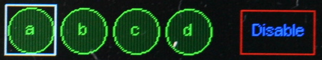
In this image Button "a" has the focus. Pressing select will press the
Button.
This emulates a pushbutton, with a callback being executed each time the button
is pressed. Physically this consists of pressing the select button when the
Button instance has focus. Buttons may be any one of three shapes: CIRCLE,
RECTANGLE or CLIPPED_RECT.
Constructor mandatory positional args:
writerTheWriterinstance (defines font) to use.rowLocation on screen.col
Optional keyword only arguments:
shape=RECTANGLEMust beCIRCLE,RECTANGLEorCLIPPED_RECT.height=20Height of the bounding box.width=50Width of the bounding box.fgcolor=NoneColor of foreground (the control itself). IfNonetheWriterforeground default is used.bgcolor=NoneBackground color of object. IfNonetheWriterbackground default is used.bdcolor=FalseColor of border. IfFalseno border will be drawn. If a color is provided, a border line will be drawn around the control.textcolor=NoneText color. Defaults tofgcolor.litcolor=NoneIf provided the button will display this color for one second after being pressed.textShown in centre of button. Default: an empty string.callbackCallback function which runs when button is pressed.argsA list/tuple of arguments for the above callback. Default[].onreleaseDefaultFalse. IfTruethe callback will occur when theselectpushbutton is released otherwise it will occur when pressed.
Method:
greyed_outOptional Boolean argumentvaldefaultNone. IfNonereturns the current 'greyed out' status of the control. Otherwise enables or disables it, showing it in its new state.
Class variable:
lit_timePeriod in seconds thelitcoloris displayed. Default 1.
CloseButton
This Button subclass is a special case of a Button. Its constructor takes a
single arg, being a Writer instance. It produces a red "X" button at the top
right hand corner of the current Screen. Operating it causes the screen to
close, with the screen below being revealed. On the bottom level screen, a
CloseButton will shut down the application.
10. ButtonList object
from gui.core.colors import *  # Colors and shapes
from gui.widgets.buttons import Button, ButtonList
A ButtonList groups a number of buttons together to implement a button which
changes state each time it is pressed. For example it might toggle between a
green Start button and a red Stop button. The buttons are defined and added in
turn to the ButtonList object. Typically they will be the same size, shape
and location but will differ in color and/or text. At any time just one of the
buttons will be visible, initially the first to be added to the object.
Buttons in a ButtonList should not have callbacks. The ButtonList has
its own user supplied callback which runs each time the object is pressed.
However each button can have its own list of args. Callback arguments
comprise the currently visible button followed by its arguments.
Constructor argument:
callbackThe callback function. Default does nothing.
Methods:
add_buttonAdds a button to theButtonList. Arguments: as per theButtonconstructor. Returns the button object.greyed_outOptional Boolean argumentvaldefaultNone. IfNonereturns the current 'greyed out' status of the control. Otherwise enables or disables it, showing it in its new state.valueOptional argument: a button in the set. If supplied and the button is not active the currency changes to the supplied button and its callback is run. Always returns the active button.
Typical usage is as follows:
def callback(button, arg):
    print(arg)

table = [
     {'fgcolor' : GREEN, 'shape' : CLIPPED_RECT, 'text' : 'Start', 'args' : ['Live']},
     {'fgcolor' : RED, 'shape' : CLIPPED_RECT, 'text' : 'Stop', 'args' : ['Die']},
]
bl = ButtonList(callback)
for t in table:  # Buttons overlay each other at same location
    bl.add_button(wri, 10, 10, textcolor = BLACK, **t)
11. RadioButtons object
from gui.core.colors import *  # Colors and shapes
from gui.widgets.buttons import Button, RadioButtons
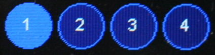
This object groups a set of buttons at different locations. When a button is pressed, it becomes highlighted and remains so until another button is pressed. A callback runs each time the current button is changed.
Constructor positional arguments:
highlightColor to use for the highlighted button. Mandatory.callbackCallback when a new button is pressed. Default does nothing.selectedIndex of initial button to be highlighted. Default 0.
Methods:
add_buttonAdds a button. Arguments: as per theButtonconstructor. Returns the Button instance.greyed_outOptional Boolean argumentvaldefaultNone. IfNonereturns the current 'greyed out' status of the control. Otherwise enables or disables it, showing it in its new state.valueOptional argument: a button in the set. If supplied, and the button is not currently active, the currency changes to the supplied button and its callback is run. Always returns the currently active button.
Typical usage:
def callback(button, arg):
    print(arg)

table = [
    {'text' : '1', 'args' : ['1']},
    {'text' : '2', 'args' : ['2']},
    {'text' : '3', 'args' : ['3']},
    {'text' : '4', 'args' : ['4']},
]
col = 0
rb = RadioButtons(callback, BLUE) # color of selected button
for t in table:
    rb.add_button(wri, 10, col, textcolor = WHITE,
                  fgcolor = LIGHTBLUE, height = 40, **t)
    col += 60 # Horizontal row of buttons
12. Listbox widget
from gui.widgets.listbox import Listbox, ON_MOVE, ON_LEAVE
A Listbox is an active widget. Its height is determined by the number of
entries in it and the font in use. Scrolling is not supported. When the widget
has focus the currently selected element may be changed using increase and
decrease buttons. On pressing select a callback runs.
Constructor mandatory positional args:
writerTheWriterinstance (defines font) to use.rowLocation on screen.col
Mandatory keyword only argument:
elementsA list or tuple of strings to display. Must have at least one entry.
Optional keyword only arguments:
width=NoneControl width in pixels. By default this is calculated to accommodate all elements.value=0Index of currently selected list item.fgcolor=NoneColor of foreground (the control itself). IfNonetheWriterforeground default is used.bgcolor=NoneBackground color of object. IfNonetheWriterbackground default is used.bdcolor=FalseColor of border. IfFalseno border will be drawn. If a color is provided, a border line will be drawn around the control.fontcolorText color. Defaults to system text color.select_colorBackground color for selected item in list. DefaultLIGHTBLUE.callbackCallback function which runs whenselectis pressed.argsA list/tuple of arguments for above callback. Default[].also=0Options areON_MOVEorON_LEAVE. By default the callback runs only when theselectbutton is pressed. TheON_LEAVEvalue meanse that it will also run when the focus moves from the control if the currently selected element has been changed. TheON_MOVEarg causes the callback to run every time the highlighted element is changed.
Methods:
greyed_outOptional boolean argumentvaldefaultNone. IfNonereturns the current 'greyed out' status of the control. Otherwise enables or disables it, showing it in its new state.valueArgumentvaldefaultNone. If the argument is provided which is a valid index into the list that entry becomes current and the callback is executed. Always returns the index of the currently active entry.textvalueArgumenttexta string defaultNone. If the argument is provided and is in the control's list, that item becomes current. Returns the current string, unless the arg was provided but did not correspond to any list item. In this event the control's state is not changed andNoneis returned.
The callback's first argument is the listbox instance followed by any args
specified to the constructor. The currently selected item may be retrieved by
means of the instance's value or textvalue methods.
13. Dropdown widget
from gui.widgets.dropdown import Dropdown
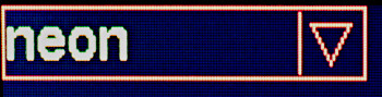
Closed dropdown list.
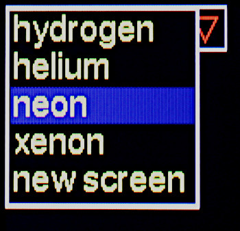
Open dropdown list.
A dropdown list. The list, when active, is drawn below the control. The height of the control is determined by the height of the font in use. The height of the list is determined by the number of entries in it and the font in use. Scrolling is not supported.
Constructor mandatory positional args:
writerTheWriterinstance (defines font) to use.rowLocation on screen.col
Mandatory keyword only argument:
elementsA list or tuple of strings to display. Must have at least one entry.
Optional keyword only arguments:
width=NoneControl width in pixels. By default this is calculated to accommodate all elements.value=0Index of currently selected list item. Default 0.fgcolor=NoneColor of foreground (the control itself). IfNonetheWriterforeground default is used.bgcolor=NoneBackground color of object. IfNonetheWriterbackground default is used.bdcolor=FalseColor of border. IfFalseno border will be drawn. If a color is provided, a border line will be drawn around the control.fontcolor=NoneText color. Defaults to foreground color.select_color=DARKBLUEBackground color for selected item in list.callback=dolittleCallback function which runs when a list entry is picked.args=[]A list/tuple of arguments for above callback.
Methods:
greyed_outOptional boolean argumentvaldefaultNone. IfNonereturns the current 'greyed out' status of the control. Otherwise enables or disables it, showing it in its new state.valueArgumentvaldefaultNone. If the argument is provided which is a valid index into the list that entry becomes current and the callback is executed. Always returns the index of the currently active entry.textvalueArgumenttexta string defaultNone. If the argument is provided and is in the control's list, that item becomes current. Returns the current string, unless the arg was provided but did not correspond to any list item. In this event the control's state is not changed andNoneis returned.
If select is pressed when the Dropdown has focus, the list is displayed.
The increase and decrease buttons move the list currency. If select is
pressed after changing the currency the callback is triggered, the list is
closed and the control will display the newly selected entry. If next or
prev are pressed while the list is open, focus will move to the next widget.
In this event the list will close and no selection change will be recognised:
the control will show the element which was visible at the start and the
callback will not run. Moving the focus is a means of cancelling any changes.
The callback's first argument is the dropdown instance followed by any args
specified to the constructor. The currently selected item may be retrieved by
means of the instance's value or textvalue methods.
14. DialogBox class
from gui.widgets.dialog import DialogBox
This implements a modal dialog box based on a horizontal row of pushbuttons. Any button press will close the dialog. The caller can determine which button was pressed. The size of the buttons and the width of the dialog box are calculated from the strings assigned to the buttons. This ensures that buttons are evenly spaced and identically sized. Typically used for simple queries such as "yes/no/cancel".
Constructor mandatory positional args:
writerTheWriterinstance (defines font) to use.rowLocation on screen.col
Mandatory keyword only arg:
elementsA list or tuple of 2-tuples. Each defines the text and color of a pushbutton, e.g.(('Yes', RED), ('No', GREEN)).
Optional keyword only args:
label=NoneText for an optional label displayed in the centre of the dialog box.bgcolor=DARKGREENBackground color of window.buttonwidth=25Minimum width of buttons. In general button dimensions are calculated from the size of the strings inelements.closebutton=TrueIf set, aclosebutton will be displayed at the top RH corner of the dialog box.callback=dolittleargs=[]
The DialogBox is a Window subclass. Pressing any button closes the dialog
and sets the Window value to the text of the button pressed or "Close" in the
case of the close button. The outcome can therefore be tested by running
Window.value() or by implementing the callback. The latter receives the
DialogBox instance as a first arg, followed by any args supplied to the
constructor.
Note that dialog boxes can also be constructed manually, allowing for more
flexible designs. For example these might have widgets other than pushbuttons.
The approach is to write a user subclass of Window. Example code may be found
in gui/demos/screens.py.
15. Textbox widget
from gui.widgets.textbox import Textbox
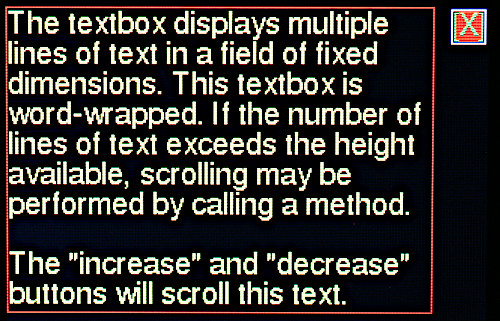
Displays multiple lines of text in a field of fixed dimensions. Text may be
clipped to the width of the control or may be word-wrapped. If the number of
lines of text exceeds the height available, scrolling will occur. Access to
text that has scrolled out of view may be achieved by calling a method. If the
widget is instantiated as active scrolling may be performed using the
increase and decrease buttons. The widget supports fixed and variable pitch
fonts.
Constructor mandatory positional arguments:
writerTheWriterinstance (font and screen) to use.rowLocation on screen.colwidthWidth of the object in pixels.nlinesNumber of lines of text to display. The object's height is determined from the height of the font:
height in pixels = nlines*font_height
As per most widgets the border is drawn two pixels beyond the control's boundary.
Keyword only arguments:
fgcolor=NoneColor of foreground (the control itself). IfNonetheWriterforeground default is used.bgcolor=NoneBackground color of object. IfNonetheWriterbackground default is used.bdcolor=FalseColor of border. IfFalseno border will be drawn. If a color is provided, a border line will be drawn around the control.clip=TrueBy default lines too long to display are right clipped. IfFalseis passed, word-wrap is attempted. If the line contains no spaces it will be wrapped at the right edge of the window.active=FalseIfTruescrolling may be performed via theincreaseanddecreasebuttons.
Methods:
appendArgss, ntrim=None, line=NoneAppend the stringsto the display and scroll up as required to show it. By default only the number of lines which will fit on screen are retained. If an integerntrim=Nis passed, only the last N lines are retained;ntrimmay be greater than can be shown in the control, hidden lines being accessed by scrolling.
If an integer (typically 0) is passed inlinethe display will scroll to show that line.scrollArgnNumber of lines to scroll. A negative number scrolls up. If scrolling would achieve nothing because there are no extra lines to display, nothing will happen. ReturnsTrueif scrolling occurred, otherwiseFalse.valueNo args. Returns the number of lines of text stored in the widget.clearNo args. Clears all lines from the widget and refreshes the display.gotoArgline=NoneFast scroll to a line. By default shows the end of the text. 0 shows the start.
Fast updates:
Rendering text to the screen is relatively slow. To send a large amount of text
the fastest way is to perform a single append. Text may contain newline
('\n') characters as required. In that way rendering occurs once only.
ntrim__
If text is regularly appended to a Textbox its buffer grows, using RAM. The
value of ntrim sets a limit to the number of lines which are retained, with
the oldest (topmost) being discarded as required.
16. Meter widget
from gui.widgets.meter import Meter

This passive widget provides a vertical linear meter display of values scaled between 0.0 and 1.0.
Constructor mandatory positional args:
writerTheWriterinstance (defines font) to use.rowLocation on screen.col
Keyword only args:
height=50Height of meter.width=10Width.fgcolor=NoneColor of foreground (the control itself). IfNonetheWriterforeground default is used.bgcolor=NoneBackground color of object. IfNonetheWriterbackground default is used.bdcolor=FalseColor of border. IfFalseno border will be drawn. If a color is provided, a border line will be drawn around the control.ptcolor=NoneColor of meter pointer or bar. Default is foreground color.divisions=5No. of graduations to show.label=NoneA text string will cause aLabelto be drawn below the meter. An integer will create aLabelof that width for later use.style=Meter.LINEThe pointer is a horizontal line.Meter.BARcauses a vertical bar to be displayed. Much easier to read on monochrome displays.legends=NoneIf a tuple of strings is passed,Labelinstances will be displayed to the right hand side of the meter, starting at the bottom. E.G.('0.0', '0.5', '1.0')value=NoneInitial value. IfNonethe meter will not be drawn until itsvalue()method is called.
Methods:
valueArgs:n=None, color=None.nshould be a float in range 0 to 1.0. Causes the meter to be updated. Out of range values are constrained. IfNoneis passed the meter is not updated.colorUpdates the color of the bar or line if a value is also passed.Nonecauses no change.
Returns the current value.
textUpdates the label if present (otherwise throws aValueError). Args:text=NoneThe text to display. IfNonedisplays last value.invert=FalseIf true, show inverse text.fgcolor=NoneForeground color: ifNonetheWriterdefault is used.bgcolor=NoneBackground color, as per foreground.bdcolor=NoneBorder color. As per above except that ifFalseis passed, no border is displayed. This clears a previously drawn border.
showNo args. (Re)draws the meter. Primarily for internal use by GUI.
17. Slider and HorizSlider widgets
from gui.widgets.sliders import Slider, HorizSlider
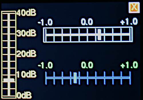
Different styles of slider.
These emulate linear potentiometers in order to display or control floating
point values. Vertical Slider and horizontal HorizSlider variants are
available. These are constructed and used similarly. The short forms (v) or (h)
are used below to identify these variants.
Constructor mandatory positional args:
writerTheWriterinstance (defines font) to use.rowLocation on screen.col
Optional keyword only arguments:
heightDimension of the bounding box. Default 100 pixels (v), 20 (h).widthDimension of the bounding box. Default 20 pixels (v), 100 (h).divisions=10Number of graduations on the scale.legends=NoneA tuple of strings to display near the slider. TheseLabelinstances will be distributed evenly along its length, starting at the bottom (v) or left (h).fgcolor=NoneColor of foreground (the control itself). IfNonetheWriterforeground default is used.bgcolor=NoneBackground color of object. IfNonetheWriterbackground default is used.bdcolor=FalseColor of border. IfFalseno border will be drawn. If a color is provided, a border line will be drawn around the control.fontcolor=NoneText color. Defaults to foreground color.slotcolor=NoneColor for the slot: this is a thin rectangular region in the centre of the control along which the slider moves. Defaults to the background color.callback=dolittleCallback function which runs whenever the control's value changes. If the control isactiveit also runs on instantiation. This enables dynamic color changes. Default is a null function.args=[]A list/tuple of arguments for above callback.valueThe initial value. Default 0.0: slider will be at the bottom (v), left (h).active=TrueDetermines whether the control can accept user input.
Methods:
greyed_outOptional argument, boolean or defaultval=None. IfNonereturns the current 'greyed out' status of the control. Otherwise enables or disables it, showing it in its new state.value=NoneOptional float argument. If supplied the slider moves to show the new value and the callback is triggered. The method constrains the range to 0.0 to 1.0. The method always returns the control's value.colorMandatory argcolorThe control is rendered in the selected color. This supports dynamic color changes.
When the widget has focus, the increase and decrease buttons adjust the
value. Brief presses make small changes, longer presses cause accelerating
change.
The callback receives an initial arg being the slider instance followed by any
user supplied args. They can be a bound methods, typically of a Screen
subclass. The callback runs whenever the value changes enabling dynamic color
change. See gui/demos/active.py.
18. Scale widget
from gui.widgets.scale import Scale
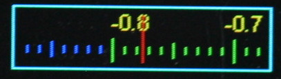
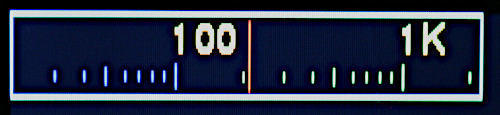
This displays floating point data having a wide dynamic range, and optionally provides for user input of such values. It is modelled on old radios where a large scale scrolls past a small window having a fixed pointer. This enables a scale with (say) 200 graduations (ticks) to readily be visible on a small display, with sufficient resolution to enable the user to interpolate between ticks. Default settings enable estimation of a value to within about +-0.1%.
Legends for the scale are created dynamically as it scrolls past the window.
The user may control this by means of a callback. The example lscale.py in
nano-gui illustrates a variable with range 88.0 to 108.0, the callback
ensuring that the display legends match the user variable. A further callback
enables the scale's color to change over its length or in response to other
circumstances.
The scale handles floats in range -1.0 <= V <= 1.0.
Constructor mandatory positional args:
writerTheWriterinstance (defines font) to use.rowLocation on screen.col
Keyword only arguments (all optional):
ticks=200Number of "tick" divisions on scale. Must be divisible by 2.legendcb=NoneCallback for populating scale legends (see below).tickcb=NoneCallback for setting tick colors (see below).height=0Pass 0 for a minimum height based on the font height.width=200fgcolor=NoneColor of foreground (the control itself). IfNonetheWriterforeground default is used.bgcolor=NoneBackground color of object. IfNonetheWriterbackground default is used.bdcolor=FalseColor of border. IfFalseno border will be drawn. If a color is provided, a border line will be drawn around the control.pointercolor=NoneColor of pointer. Defaults to.fgcolor.fontcolor=NoneColor of legends. Defaultfgcolor.value=0.0Initial value.active=FalseBy default the widget is passive. By settingactive=Truethe widget can acquire focus. When current, the value can be changed with theincreaseanddecreasebuttons. An accelerating algorithm allows rapid changes with a long button push. Short pushes change the value by a small amount, currently 0.01.
Methods:
greyed_outOptional argument, boolean or defaultval=None. IfNonereturns the current 'greyed out' status of the control. Otherwise enables or disables it, showing it in its new state.value=NoneSet or get the current value. Always returns the current value. A passedfloatis constrained to the range -1.0 <= V <= 1.0 and becomes theScale's current value. TheScaleis updated. PassingNoneenables reading the current value, but see note below on precision.
For example code see gui/demos/active.py.
Callback legendcb
The display window contains 20 ticks comprising two divisions; by default a
division covers a range of 0.1. A division has a legend at the start and end
whose text is defined by the legendcb callback. If no user callback is
supplied, legends will be of the form 0.3, 0.4 etc. User code may override
these to cope with cases where a user variable is mapped onto the control's
range. The callback takes a single float arg which is the value of the tick
(in range -1.0 <= v <= 1.0). It must return a text string. An example from the
lscale.py demo shows FM radio frequencies:
def legendcb(f):
    return '{:2.0f}'.format(88 + ((f + 1) / 2) * (108 - 88))
The above arithmetic aims to show the logic. It can (obviously) be simplified.
Callback tickcb
This callback enables the tick color to be changed dynamically. For example a
scale might change from green to orange, then to red as it nears the extremes.
The callback takes two args, being the value of the tick (in range
-1.0 <= v <= 1.0) and the default color. It must return a color. This example
is taken from the scale.py demo:
def tickcb(f, c):
    if f > 0.8:
        return RED
    if f < -0.8:
        return BLUE
    return c
Increasing the ticks value
This increases the precision of the display.
It does this by lengthening the scale while keeping the window the same size,
with 20 ticks displayed. If the scale becomes 10x longer, the value diference
between consecutive large ticks and legends is divided by 10. This means that
the tickcb callback must return a string having an additional significant
digit. If this is not done, consecutive legends will have the same value.
Precision
For performance reasons the control stores values as integers. This means that
if you set value and subsequently retrieve it, there may be some loss of
precision. Each visible division on the control represents 10 integer units.
19. ScaleLog widget
from gui.widgets.scale_log import ScaleLog
This enables the input and/or display of floating point values with extremely
wide dynamic range. This is done by means of a base 10 logarithmic scale. In
other respects the concept is that of the Scale class.
The control is modelled on old radios where a large scale scrolls past a small window having a fixed pointer. The use of a logarithmic scale enables the display and input of a value which can change by many orders of magnitude.
Legends for the scale are created dynamically as it scrolls past the window,
with one legend for each decade. The user may control this by means of a
callback, for example to display units, e.g. 10nF. A further callback
enables the scale's color to change over its length or in response to other
circumstances.
The scale displays floats in range 1.0 <= V <= 10**decades where decades is
a constructor arg. The user may readily scale these so that a control having a
range of 1-10,000 controls a user value from 1e-6 to 1e-2 while displaying
ticks labelled 1μs, 10μs, 100μs, 1ms and 10ms.
Constructor mandatory positional args:
writerTheWriterinstance (defines font) to use.rowLocation on screen.col
Keyword only arguments (all optional):
decades=5Defines the control's maximum value (i.e.10**decades).value=1.0Initial value for control. Will be constrained to1.0 <= value <= 10**decadesif outside this range.height=0Pass 0 for a minimum height based on the font height.width=160fgcolor=NoneColor of foreground (the control itself). IfNonetheWriterforeground default is used.bgcolor=NoneBackground color of object. IfNonetheWriterbackground default is used.bdcolor=FalseColor of border. IfFalseno border will be drawn. If a color is provided, a border line will be drawn around the control.pointercolor=NoneColor of pointer. Defaults to.fgcolor.fontcolor=NoneColor of legends. DefaultWHITE.legendcb=NoneCallback for populating scale legends (see below).tickcb=NoneCallback for setting tick colors (see below).callback=dolittleCallback function which will run when the user moves the scale or the value is changed programmatically. Default is a null function.args=[]A list/tuple of arguments for above callback. The callback's arguments are theScaleLoginstance, followed by any user supplied args.value=1.0Initial value.delta=0.01This determines the smallest amount of change which can be achieved with a brief button press. The value is multiplied or divided by1+delta.active=FalseDetermines whether the widget accepts user input.
Methods:
value=NoneSet or get the current value. Always returns the current value. A passedfloatis constrained to the range1.0 <= V <= 10**decadesand becomes the control's current value. TheScaleLogis updated. Always returns the control's current value. See note below on precision.greyed_outOptional Boolean argumentvaldefaultNone. IfNonereturns the current 'greyed out' status of the control. Otherwise enables or disables it, showing it in its new state.
For example code see gui/demos/active.py.
Control algorithm
When increase or decrease buttons are briefly pressed, the widget's value
is multiplied or divided by (1 + delta). A long press causes an accelerating
change. This facilitates both small and large changes. The value of delta
determines the minimum change possible and hence the level of precision that
the widget can achieve. The choice of delta represents a compromise between
precision and usability.
Callback
This receives an initial arg being the widget instance followed by any user
supplied args. They can be bound methods, typically of a Screen subclass.
cb_move runs when the value changes but before the update is processed,
enabling dynamic color change.
Callback legendcb
The start of each decade is marked by a long "tick" with a user-definable text
label. By default it will display a number corresponding to the value at that
tick (of form 10**n where n is an integer), but this can be overridden to
display values such as "10MHz". The following is a simple example from the
scale_ctrl_test demo:
def legendcb(f):
    if f < 999:
        return '{:<1.0f}'.format(f)
    return '{:<1.0f}K'.format(f/1000)
Callback tickcb
This callback enables the tick color to be changed dynamically. For example a
scale might change from green to orange, then to red as it nears the extremes.
The callback takes two args, being the value of the tick (of form 10**n where
n is an integer) and the default color. It must return a color. This example
is taken from the scale_ctrl_test demo:
def tickcb(f, c):
    if f > 30000:
        return RED
    if f < 10:
        return BLUE
    return c
20. Dial widget
from gui.widgets.dial import Dial, Pointer

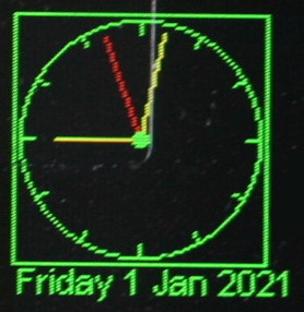
A Dial is a passive widget. It presents a circular display capable of
displaying an arbitrary number of vectors; each vector is represented by a
Pointer instance. The format of the display may be chosen to resemble an
analog clock or a compass. In the CLOCK case a pointer resembles a clock's
hand extending from the centre towards the periphery. In the COMPASS case
pointers are chevrons extending equally either side of the circle centre.
In both cases the length, angle and color of each Pointer may be changed
dynamically. A Dial can include an optional Label at the bottom which may
be used to display any required text.
In use, a Dial is instantiated. Then one or more Pointer objects are
instantiated and assigned to it. The Pointer.value method enables the Dial
to be updated affecting the length, angle and color of the Pointer.
Pointer values are complex numbers.
Dial class
Constructor mandatory positional args:
writerTheWriterinstance (defines font) to use.rowLocation on screen.col
Keyword only args:
height=100Height and width of dial.fgcolor=NoneColor of foreground (the control itself). IfNonetheWriterforeground default is used.bgcolor=NoneBackground color of object. IfNonetheWriterbackground default is used.bdcolor=FalseColor of border. IfFalseno border will be drawn. If a color is provided, a border line will be drawn around the control.ticks=4No. of gradutions to show.label=NoneA text string will cause aLabelto be drawn below the meter. An integer will create aLabelof that width for later use.style=Dial.CLOCKPointers are drawn from the centre of the circle as per the hands of a clock.Dial.COMPASScauses pointers to be drawn as arrows centred on the control's centre. Arrow tail chevrons are suppressed for very short pointers.pip=NoneDraws a central dot. A color may be passed, otherwise the foreground color will be used. IfFalseis passed, no pip will be drawn. The pip is suppressed if the shortest pointer would be hard to see.
Methods:
textUpdates the label if present (otherwise throws aValueError). Args:text=NoneThe text to display. IfNonedisplays last value.invert=FalseIf true, show inverse text.fgcolor=NoneForeground color: ifNonetheWriterdefault is used.bgcolor=NoneBackground color, as per foreground.bdcolor=NoneBorder color. As per above except that ifFalseis passed, no border is displayed. This clears a previously drawn border.
showNo args. (Re)draws the control. Primarily for internal use by GUI.
When a Pointer is instantiated it is assigned to the Dial by the Pointer
constructor.
Pointer class
Constructor arg:
dialTheDialinstance on which it is to be dsplayed.
Methods:
valueArgs:v=NoneThe value is a complex number. A magnitude exceeding unity is reduced (preserving phase) to constrain thePointerwithin the unit circle.color=NoneBy default the pointer is rendered in the foreground color of the parentDial. Otherwise the passed color is used.
Returns the current value.
Typical usage:
from hardware_setup import ssd  # Create a display instance
import uasyncio as asyncio
import cmath
from gui.core.ugui import Screen
from gui.core.writer import CWriter
from gui.core.colors import *

from gui.widgets.dial import Dial, Pointer
from gui.widgets.buttons import CloseButton
import gui.fonts.freesans20 as freesans20

async def run(dial):
    hrs = Pointer(dial)
    mins = Pointer(dial)
    hrs.value(0 + 0.7j, RED)
    mins.value(0 + 0.9j, YELLOW)
    dm = cmath.exp(-1j * cmath.pi / 30)  # Rotate by 1 minute
    dh = cmath.exp(-1j * cmath.pi / 1800)  # Rotate hours by 1 minute
    # Twiddle the hands: see aclock.py for an actual clock
    while True:
        await asyncio.sleep_ms(200)
        mins.value(mins.value() * dm, RED)
        hrs.value(hrs.value() * dh, YELLOW)

class BaseScreen(Screen):

    def __init__(self):
        super().__init__()
        wri = CWriter(ssd, freesans20, GREEN, BLACK, verbose=False)
        dial = Dial(wri, 5, 5, ticks = 12, bdcolor=None)
        self.reg_task(run(dial))
        CloseButton(wri)

Screen.change(BaseScreen)
21. Knob widget
from gui.widgets.knob import Knob
This emulates a rotary control capable of being rotated through a predefined arc in order to display or set a floating point variable.
Constructor mandatory positional args:
writerTheWriterinstance (defines font) to use.rowLocation on screen.col
Optional keyword only arguments:
height=70Dimension of the square bounding box.arc=TWOPIMovement available. Default 2*PI radians (360 degrees).ticks=9Number of graduations around the dial.fgcolor=NoneColor of foreground (the control itself). IfNonetheWriterforeground default is used.bgcolor=NoneBackground color of object. IfNonetheWriterbackground default is used.bdcolor=FalseColor of border. IfFalseno border will be drawn. If a color is provided, a border line will be drawn around the control.color=NoneFill color for the control knob. Default: no fill.callback=dolittleCallback function runs when the user moves the knob or the value is changed programmatically.args=[]A list/tuple of arguments for above callback.value=0.0Initial value. By default the knob will be at its most counter-clockwise position.active=TrueEnable user input via theincreaseanddecreasebuttons.
Methods:
greyed_outOptional Boolean argumentvaldefaultNone. IfNonereturns the current 'greyed out' status of the control. Otherwise, if the widget isactive, enables or disables it, showing it in its new state.valueOptional argumentval. If set, adjusts the pointer to correspond to the new value. The move callback will run. The method constrains the range to 0.0 to 1.0. Always returns the control's value.
22. Graph Plotting
from gui.widgets.graph import PolarGraph, PolarCurve, CartesianGraph, Curve, TSequence
For example code see gui/demos/plot.py.
22.1 Concepts
Data for Cartesian graphs constitutes a sequence of x, y pairs, for polar
graphs it is a sequence of complex z values. The module supports three
common cases:
- The dataset to be plotted is complete at the outset.
- Arbitrary data arrives gradually and needs to be plotted as it arrives.
- One or more
yvalues arrive gradually. TheXaxis represents time. This is a simplifying case of 2.
22.1.1 Graph classes
A user program first instantiates a graph object (PolarGraph or
CartesianGraph). This creates an empty graph image upon which one or more
curves may be plotted. Graphs are passive widgets so cannot accept user input.
22.1.2 Curve classes
The user program then instantiates one or more curves (Curve or
PolarCurve) as appropriate to the graph. Curves may be assigned colors to
distinguish them.
A curve is plotted by means of a user defined populate generator. This
assigns points to the curve in the order in which they are to be plotted. The
curve will be displayed on the graph as a sequence of straight line segments
between successive points.
Where it is required to plot realtime data as it arrives, this is achieved
via calls to the curve's point method. If a prior point exists it causes a
line to be drawn connecting the point to the last one drawn.
22.1.3 Coordinates
PolarGraph and CartesianGraph objects are subclassed from Widget and are
positioned accordingly by row and col with a 2-pixel outside border. The
coordinate system within a graph conforms to normal mathematical conventions.
Scaling is provided on Cartesian curves enabling user defined ranges for x and y values. Points lying outside of the defined range will produce lines which are clipped at the graph boundary.
Points on polar curves are defined as Python complex types and should lie
within the unit circle. Points which are out of range may be plotted beyond the
unit circle but will be clipped to the rectangular graph boundary.
22.2 Graph classes
22.2.1 Class CartesianGraph
Constructor.
Mandatory positional arguments:
writerACWriterinstance.rowPosition of the graph in screen coordinates.col
Keyword only arguments (all optional):
height=90Dimension of the bounding box.width=110Dimension of the bounding box.fgcolor=NoneColor of the axis lines. Defaults toWriterforeground color.bgcolor=NoneBackground color of graph. Defaults toWriterbackground.bdcolor=NoneBorder color. IfFalseno border is displayed. IfNonea border is shown in the foreground color. If a color is passed, it is used.gridcolor=NoneColor of grid. Default: Writer foreground color.xdivs=10Number of divisions (grid lines) on x axis.ydivs=10Number of divisions on y axis.xorigin=5Location of origin in terms of grid divisions.yorigin=5Asxorigin. The default of 5, 5 with 10 grid lines on each axis puts the origin at the centre of the graph. Settings of 0, 0 would be used to plot positive values only.
Method:
showNo args. Redraws the empty graph. Used when plotting time sequences.
22.2.2 Class PolarGraph
Constructor.
Mandatory positional arguments:
writerACWriterinstance.rowPosition of the graph in screen coordinates.col
Keyword only arguments (all optional):
height=90Dimension of the square bounding box.fgcolor=NoneColor of the axis lines. Defaults toWriterforeground color.bgcolor=NoneBackground color of graph. Defaults toWriterbackground.bdcolor=NoneBorder color. IfFalseno border is displayed. IfNonea border is shown in theWriterforeground color. If a color is passed, it is used.gridcolor=NoneColor of grid. Default: Writer foreground color.adivs=3Number of angle divisions per quadrant.rdivs=4Number radius divisions.
Method:
showNo args. Redraws the empty graph.
22.3 Curve classes
22.3.1 class Curve
The Cartesian curve constructor takes the following positional arguments:
Mandatory arguments:
graphTheCartesianGraphinstance.colorIfNoneis passed, thegraphforeground color is used.
Optional arguments:
3. populate=None A generator to populate the curve. See below.
4. origin=(0,0) 2-tuple containing x and y values for the origin. Provides
for an optional shift of the data's origin.
5. excursion=(1,1) 2-tuple containing scaling values for x and y.
Methods:
pointArguments x, y. DefaultsNone. Adds a point to the curve. If a prior point exists a line will be drawn between it and the current point. If a point is out of range or if either arg isNoneno line will be drawn. Passing no args enables discontinuous curves to be plotted. This method is normally used for real time plotting.
The populate generator may take zero or more positional arguments. It should
repeatedly yield x, y values before returning. Where a curve is discontinuous
None, None may be yielded: this causes the line to stop. It is resumed when
the next valid x, y pair is yielded.
If populate is not provided the curve may be plotted by successive calls to
the point method. This may be of use where data points are acquired in real
time, and realtime plotting is required. See class RTRect in
gui/demos/plot.py.
Scaling
By default, with symmetrical axes, x and y values are assumed to lie between -1 and +1.
To plot x values from 1000 to 4000 we would set the origin x value to 1000
and the excursion x value to 3000. The excursion values scale the plotted
values to fit the corresponding axis.
22.3.2 class PolarCurve
The constructor takes the following positional arguments:
Mandatory arguments:
graphThePolarGraphinstance.color
Optional arguments:
3. populate=None A generator to populate the curve. See below.
Methods:
pointArgumentz=None. Normally acomplex. Adds a point to the curve. If a prior point exists a line will be drawn between it and the current point. If the arg isNoneno line will be drawn. Passing no args enables discontinuous curves to be plotted. Lines are clipped at the square region bounded by (-1, -1) to (+1, +1).
The populate generator may take zero or more positional arguments. It should
yield a complex z value for each point before returning. Where a curve is
discontinuous a value of None may be yielded: this causes plotting to stop.
It is resumed when the next valid z point is yielded.
If populate is not provided the curve may be plotted by successive calls to
the point method. This may be of use where data points are acquired in real
time, and realtime plotting is required. See class RTPolar in
gui/demos/plot.py.
Scaling
Complex points should lie within the unit circle to be drawn within the grid.
22.4 class TSequence
A common task is the acquisition and plotting of real time data against time, such as hourly temperature and air pressure readings. This class facilitates this. Time is on the x-axis with the most recent data on the right. Older points are plotted to the left until they reach the left hand edge when they are discarded. This is akin to old fashioned pen plotters where the pen was at the rightmost edge (corresponding to time now) with old values scrolling to the left with the time axis in the conventional direction.
The user instantiates a graph with the X origin at the right hand side and then
instantiates one or more TSequence objects. As each set of data arrives it is
appended to its TSequence using the add method. See the example below.
The constructor takes the following args:
Mandatory arguments:
graphTheCartesianGraphinstance.colorsizeInteger. The number of time samples to be plotted. See below.
Optional arguments:
4. yorigin=0 These args provide scaling of Y axis values as per the Curve
class.
5 yexc=1
Method:
addArgvthe value to be plotted. This should lie between -1 and +1 unless scaling is applied.
Note that there is little point in setting the size argument to a value
greater than the number of X-axis pixels on the graph. It will work but RAM
and execution time will be wasted: the constructor instantiates an array of
floats of this size.
Each time a data set arrives the graph should be cleared and a data value
is added to each TSequence instance. The following (slightly simplified) is
taken from gui/demos/plot.py and simulates the slow arrival of sinusoidal
values.
class TSeq(Screen):
    def __init__(self):
        super().__init__()
        self.g = CartesianGraph(wri, 2, 2, xorigin = 10, fgcolor=GREEN,
                                gridcolor=LIGHTGREEN, bdcolor=False)

    def after_open(self):  # After graph has been drawn
        self.reg_task(self.run(self.g), True)  # Cancel on screen change

    async def run(self, g):
        await asyncio.sleep_ms(0)
        tsy = TSequence(g, YELLOW, 50)
        tsr = TSequence(g, RED, 50)
        t = 0
        while True:
            g.show()  # Redraw the empty graph
            tsy.add(0.9*math.sin(t/10))
            tsr.add(0.4*math.cos(t/10))  # Plot the new curves
            await asyncio.sleep_ms(400)
            t += 1
23. Application design
23.1 Tab order and button layout
The "tab order" of widgets on a Screen is the order with which they acquire
focus with successive presses of the Next button. It is determined by the
order in which they are instantiated.
The obvious layout for the physical buttons is as per a joystick:
| Increase | ||
| Prev | Select | Next |
| Decrease |
This works well with many screen layouts, if the tab order is considered in the
layout of the screen. It works well with most widgets including vertical ones
such as the Slider. With horizontal widgets such as Scale controls it can
be counter intuitive because the horizontal layout does not match the position
of the increase and decrease buttons. A different physical layout may be
preferred.
The apparently obvious solution of designing a vertical Scale is tricky owing
to the fact that the length of the internal text can be substantial and
variable.
23.2 Use of graphics primitives
(ssd and display objects)